2021
DICTIONARY
.COMDictionary.com was exploring possible routes for a rebrand in the image of an educational platform rather than a traditional dictionary. They saw themselves as “a layered dictionary” for learners at all stages of life and mastery, and were looking for an identity that speaks to change, wonder, versatility, technology and AI. Though the partnership with Manual was later dissolved due to circumstantial reasons, I truly enjoyed developing this brand concept.

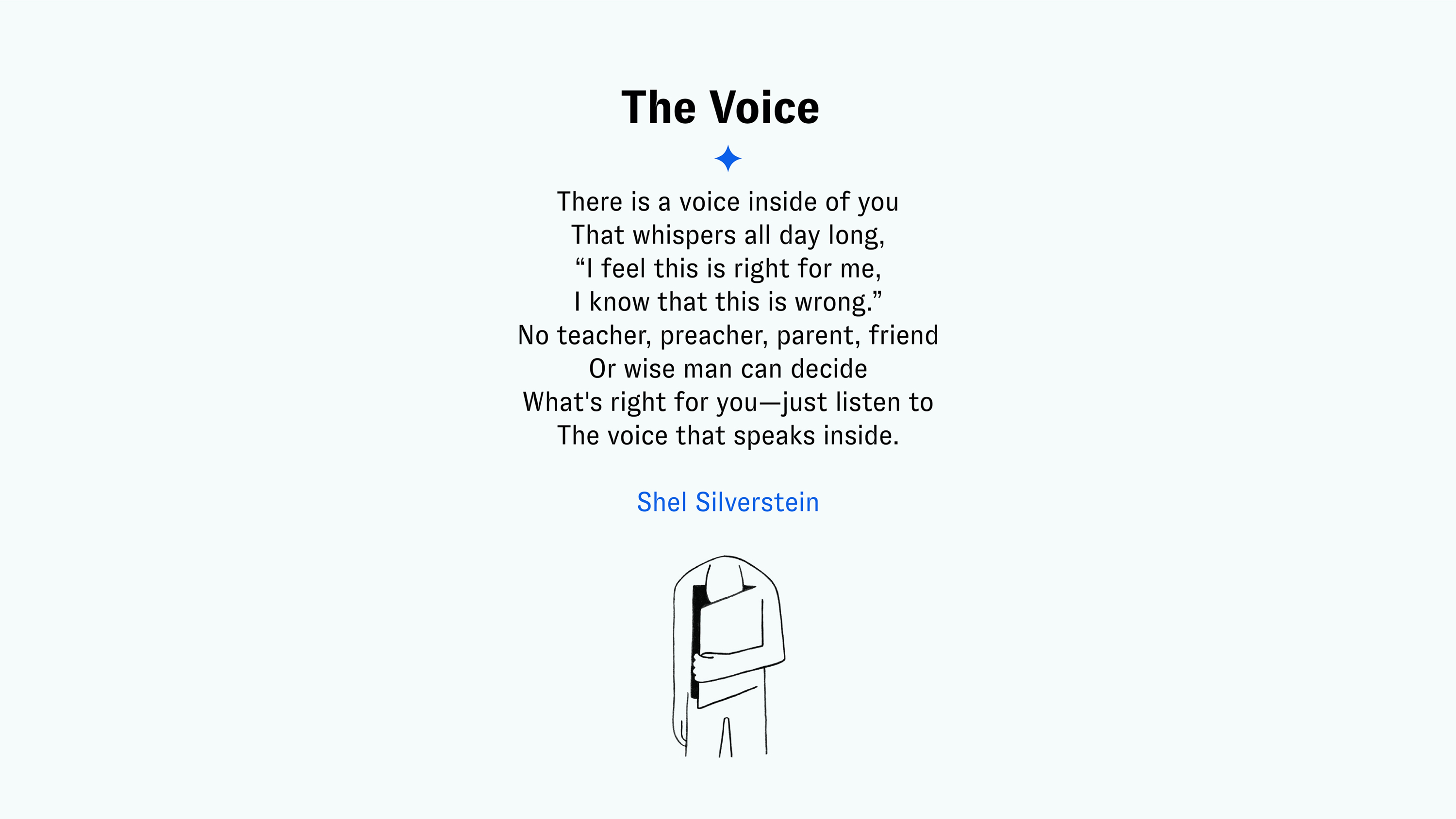
The Spark
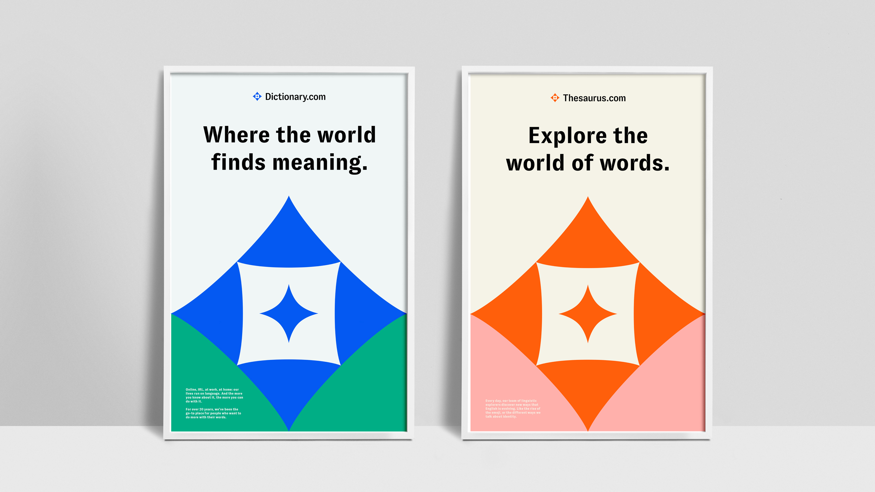
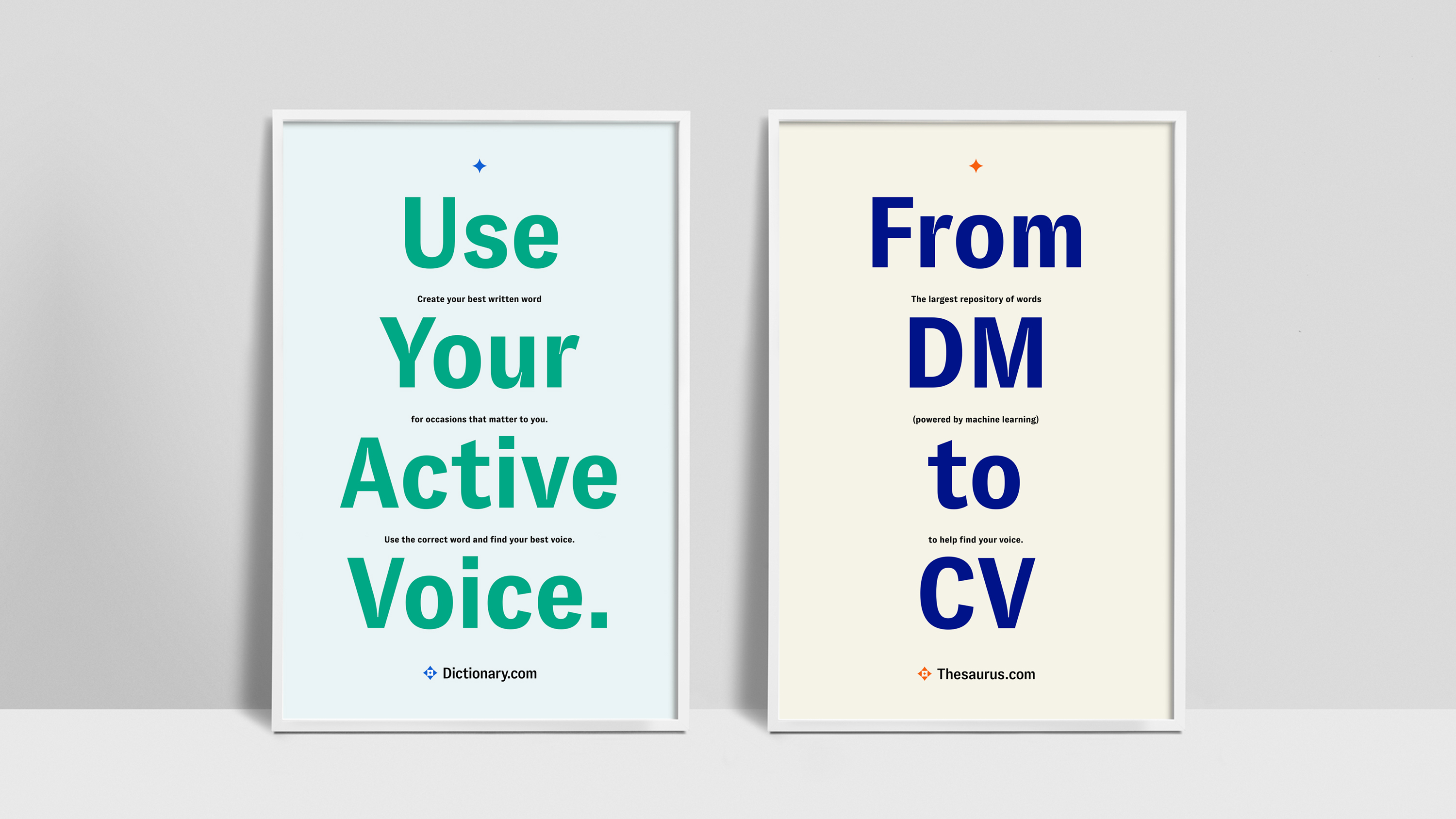
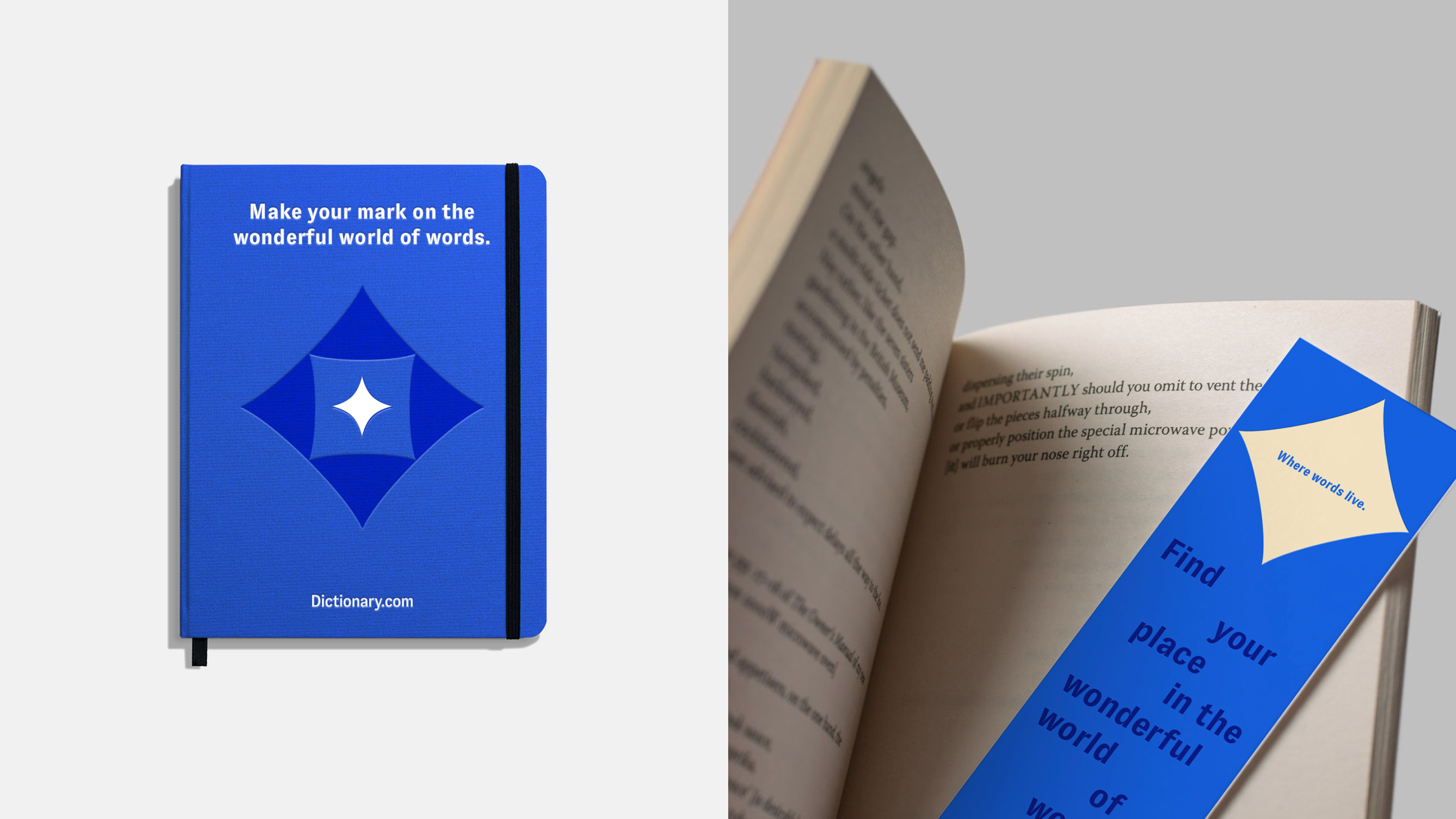
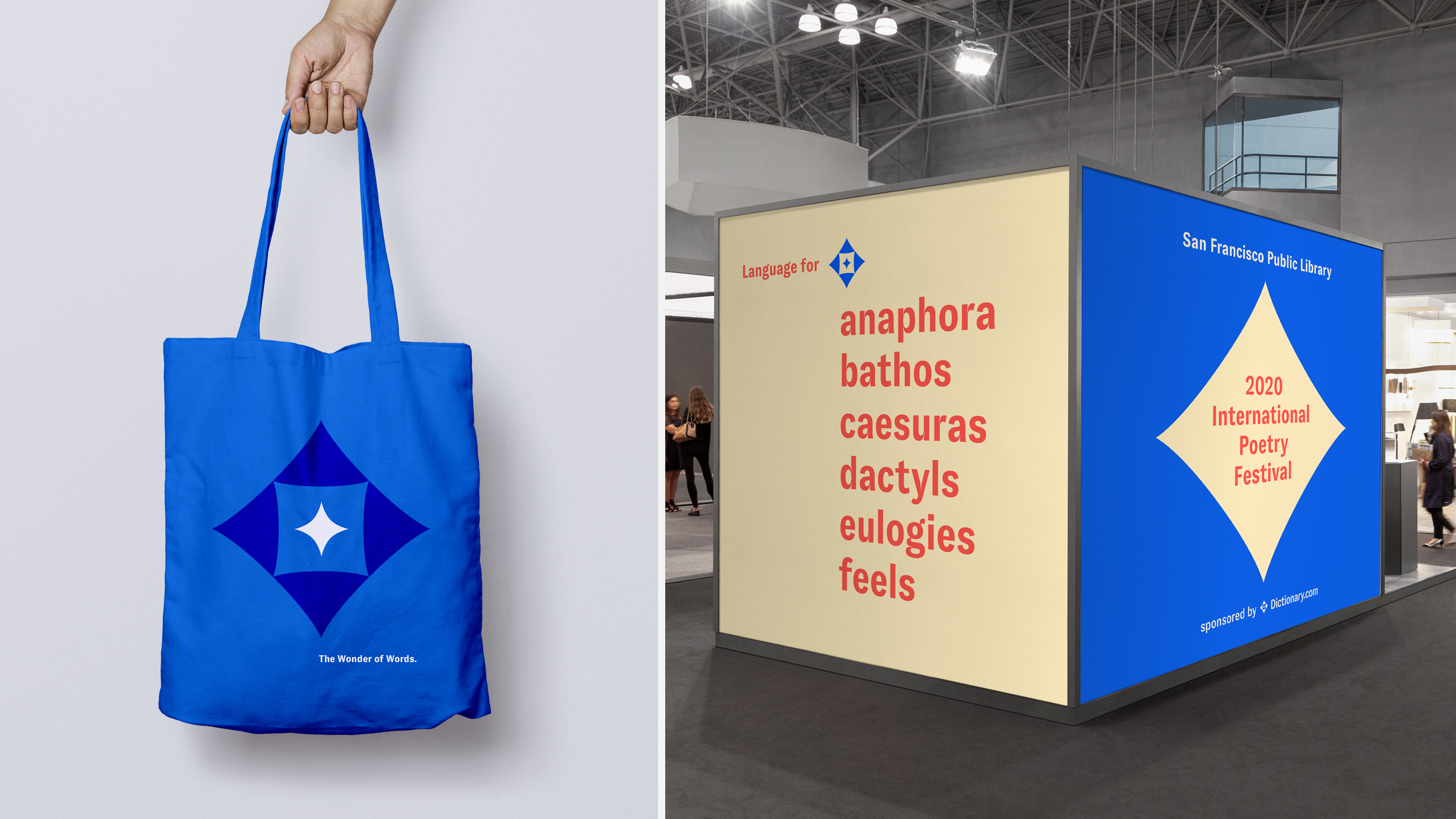
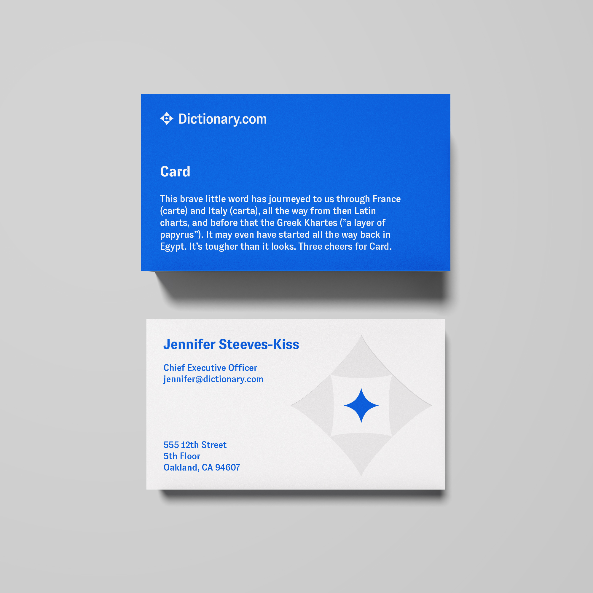
Dictionary.com brings out the spark of inspiration inside all of us. This concept is about navigating language to find our true voice, using words to orient ourselves and deliver our best expression. Harking back to an ancient spirit of exploration, the Spark draws on visual cues around compasses, polished gems, stars and radiant light. Words spark emotions and ideas.
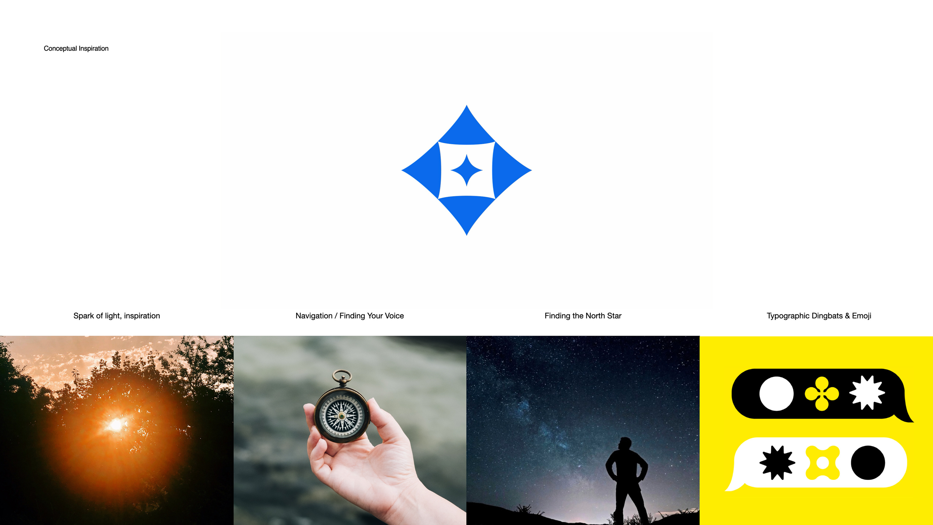
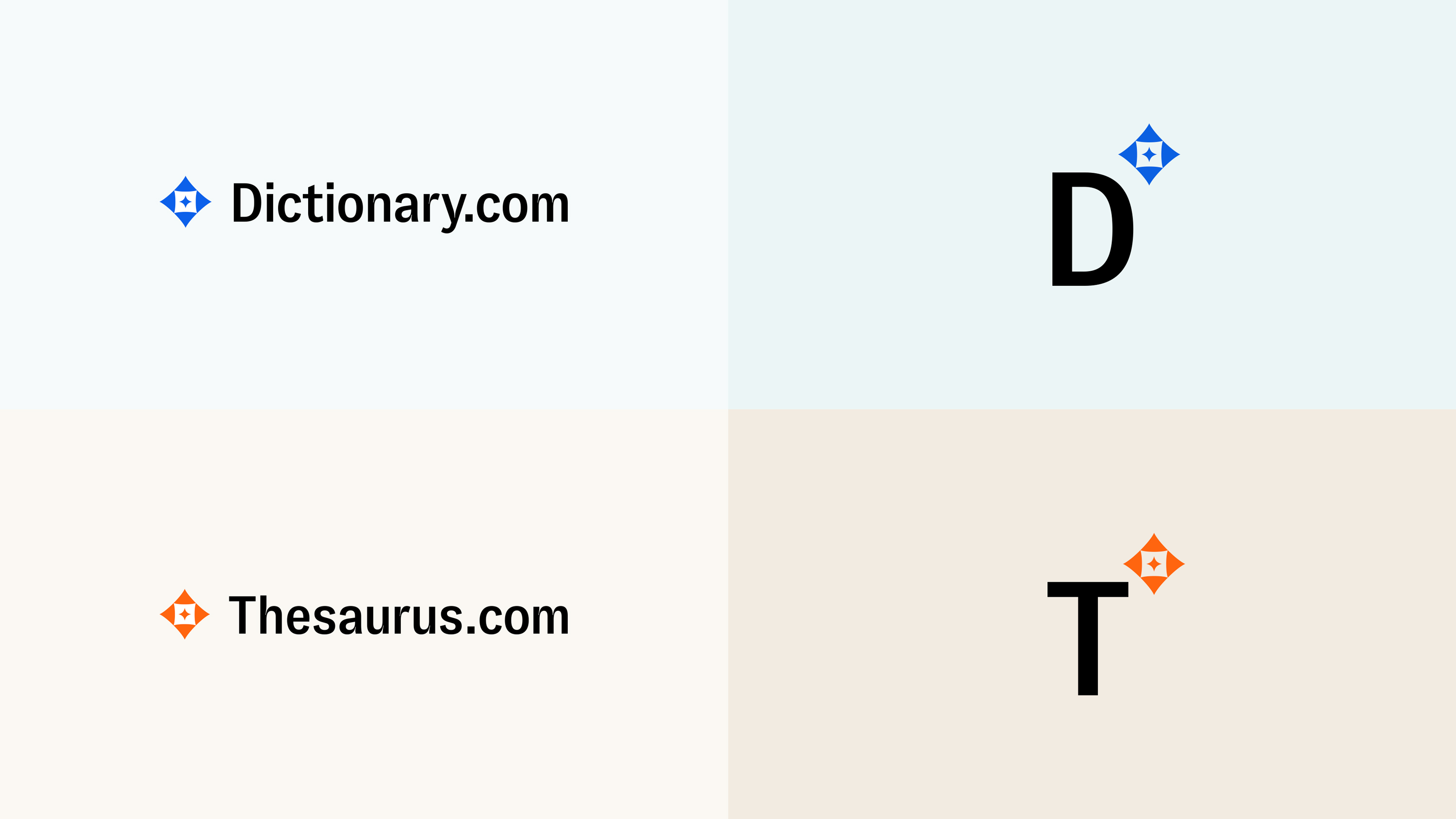
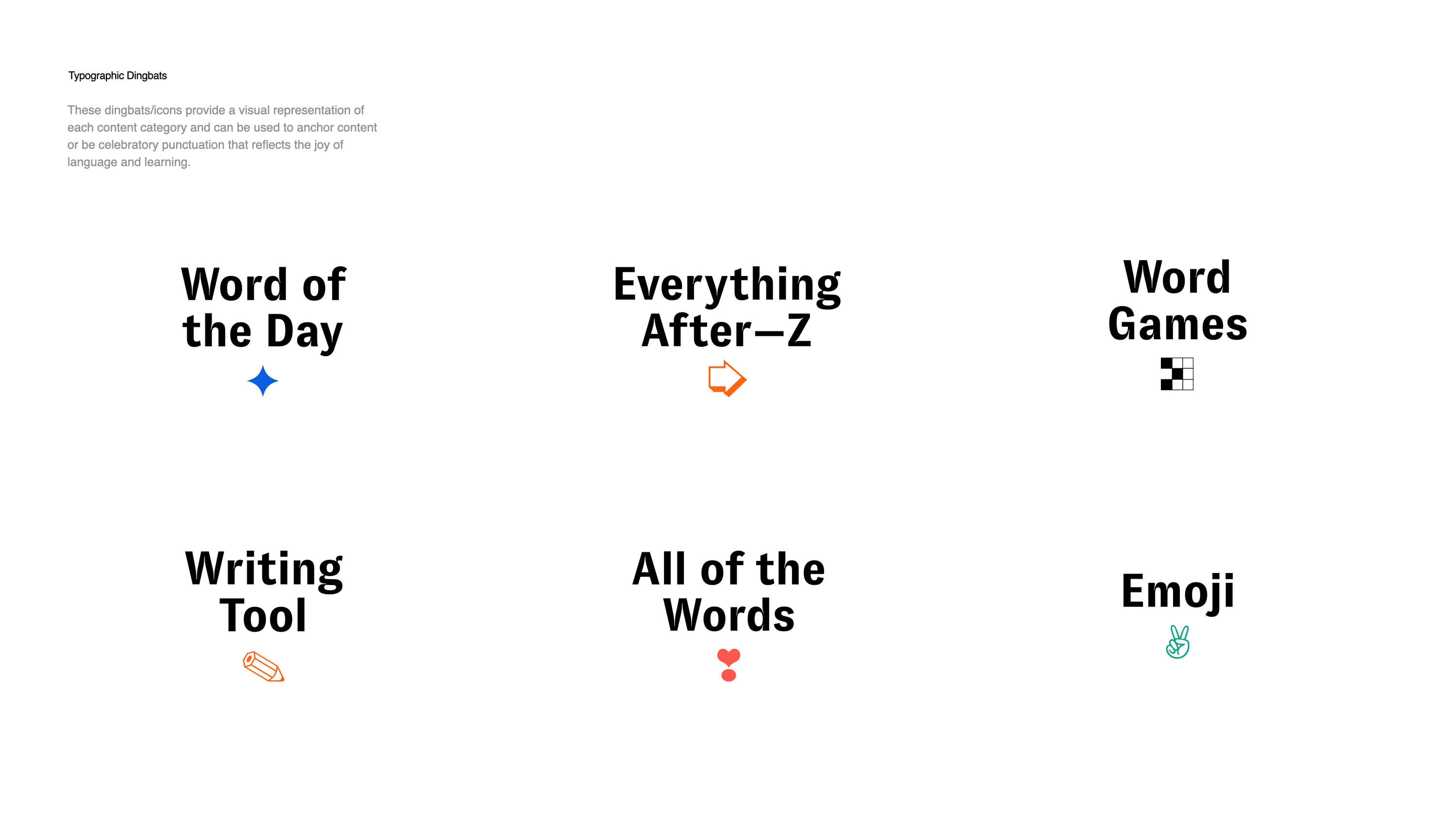
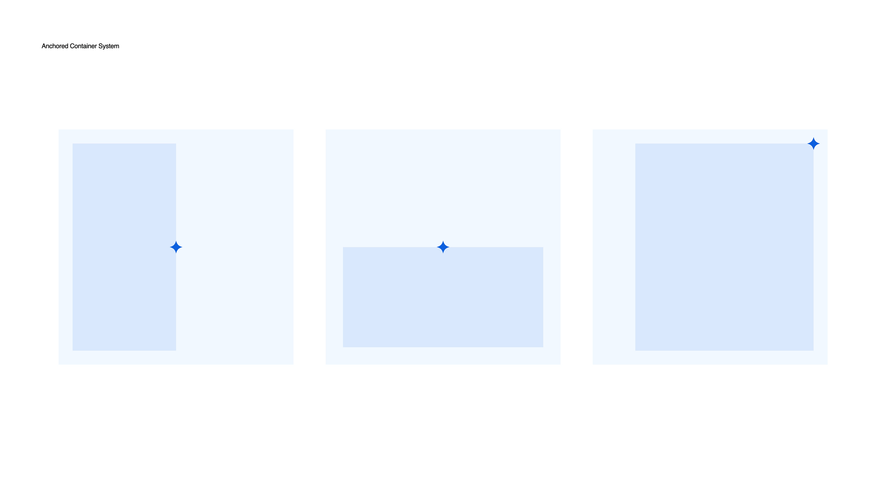
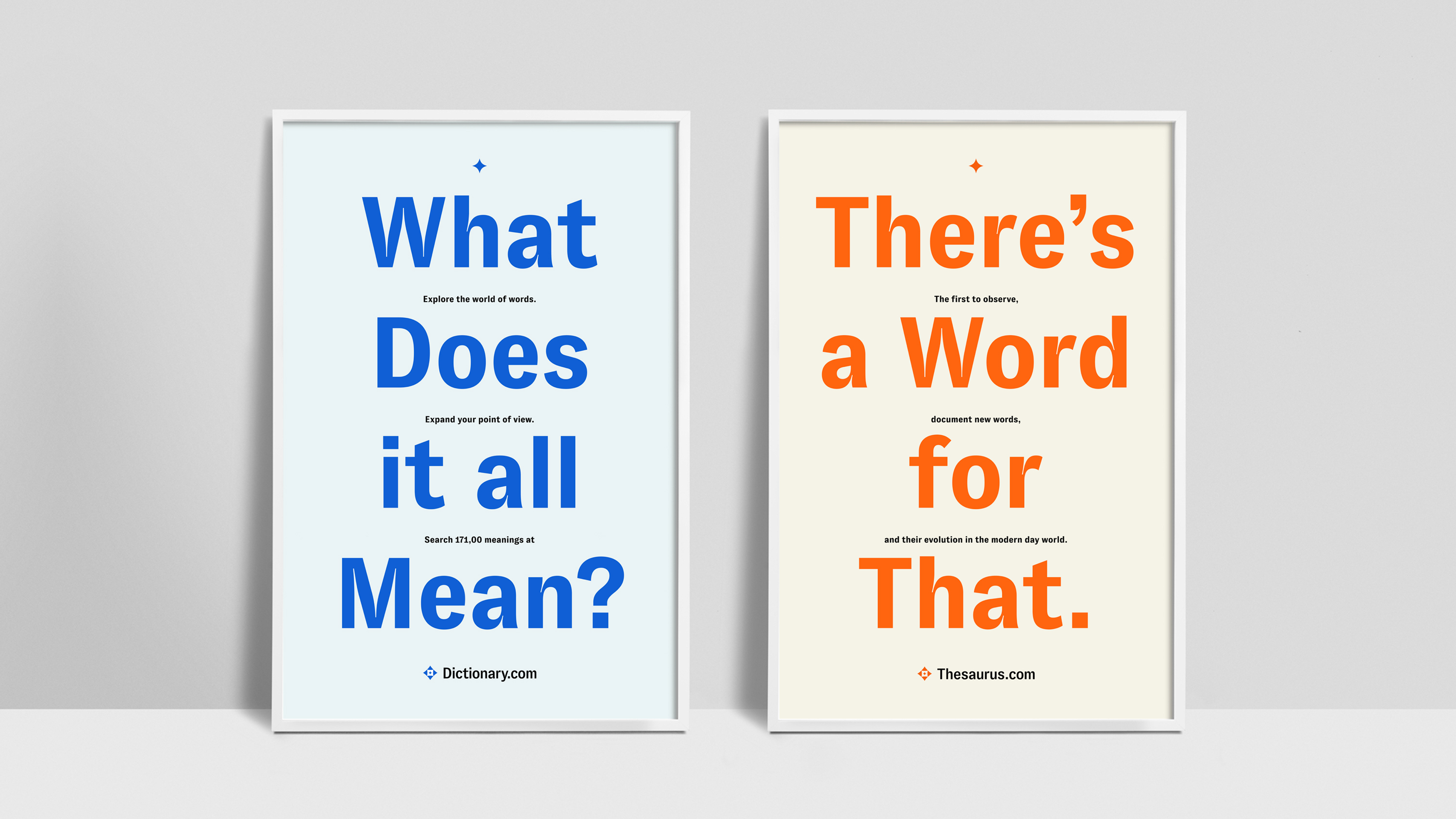
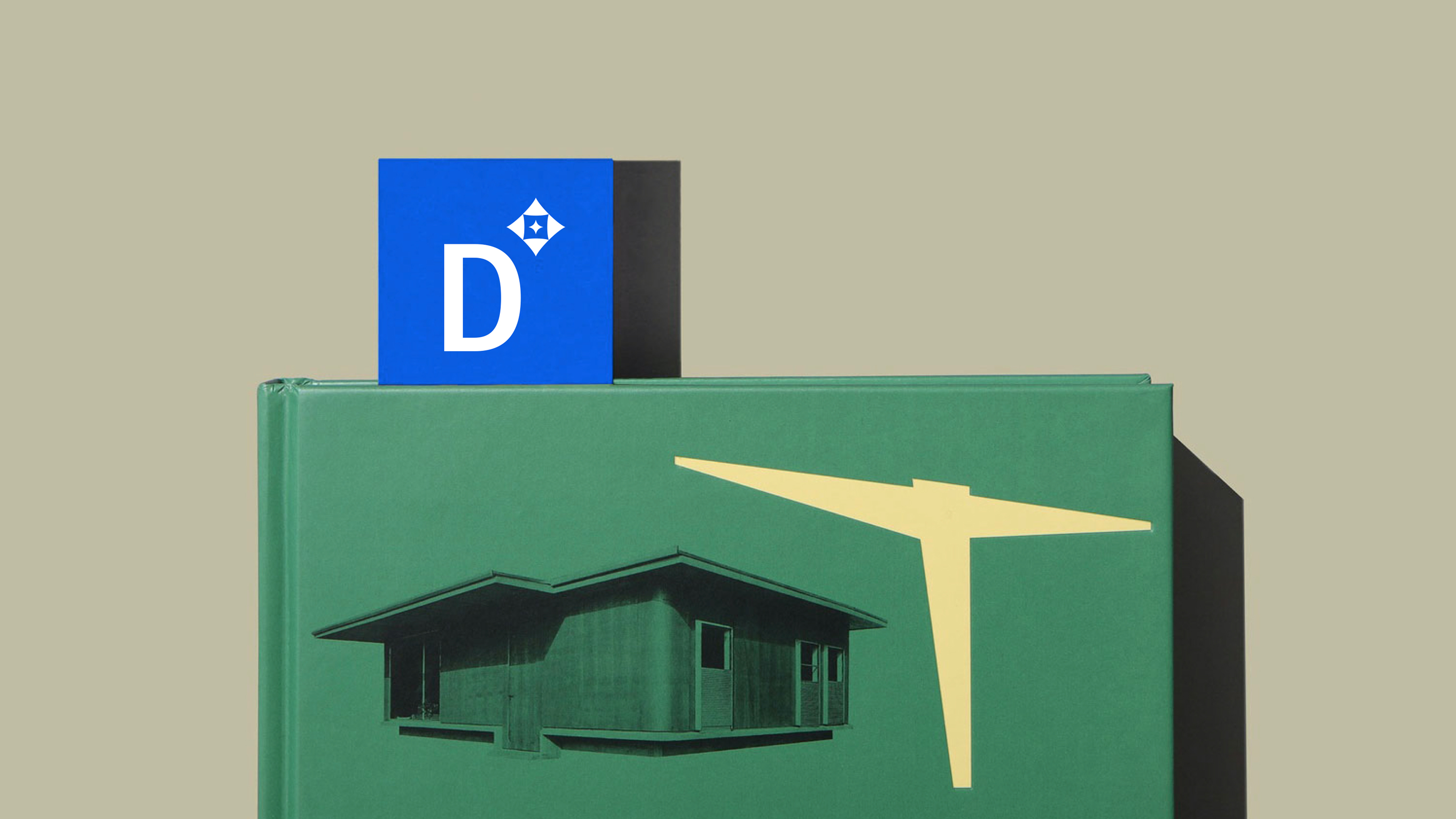
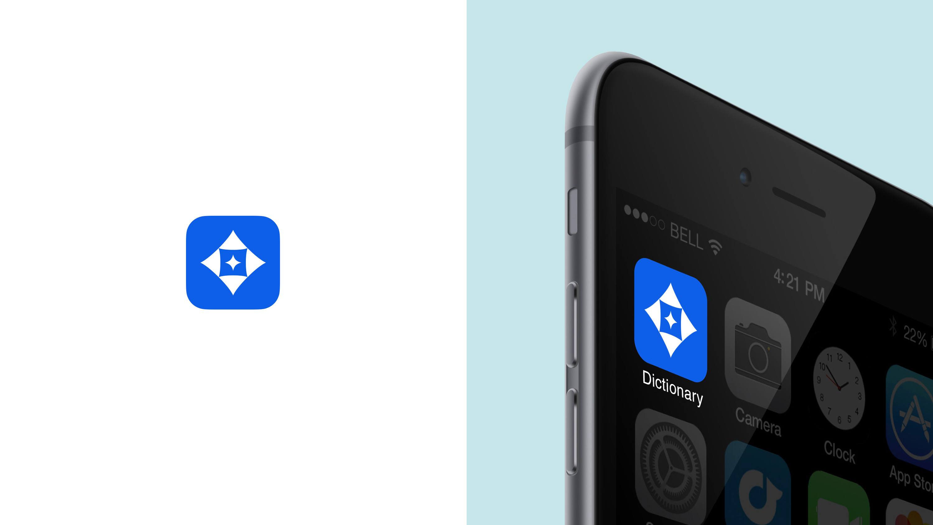
As a logomark, the Spark feels curious, empowering and almost musical. It’s constructed with 3 layers that fan out to suggest a sense of outward expansion and multifaceted growth, 4 points reminiscent of a compass and the cardinal directions. In motion, the Spark animates in a way that reflects “a layered dictionary” and rotates smoothly to toggle between platforms. Its glyph lockup is also a nod to typographic traditions such as asterisks, superscripts and paragraph symbols.

Formal Explorations ︎︎︎
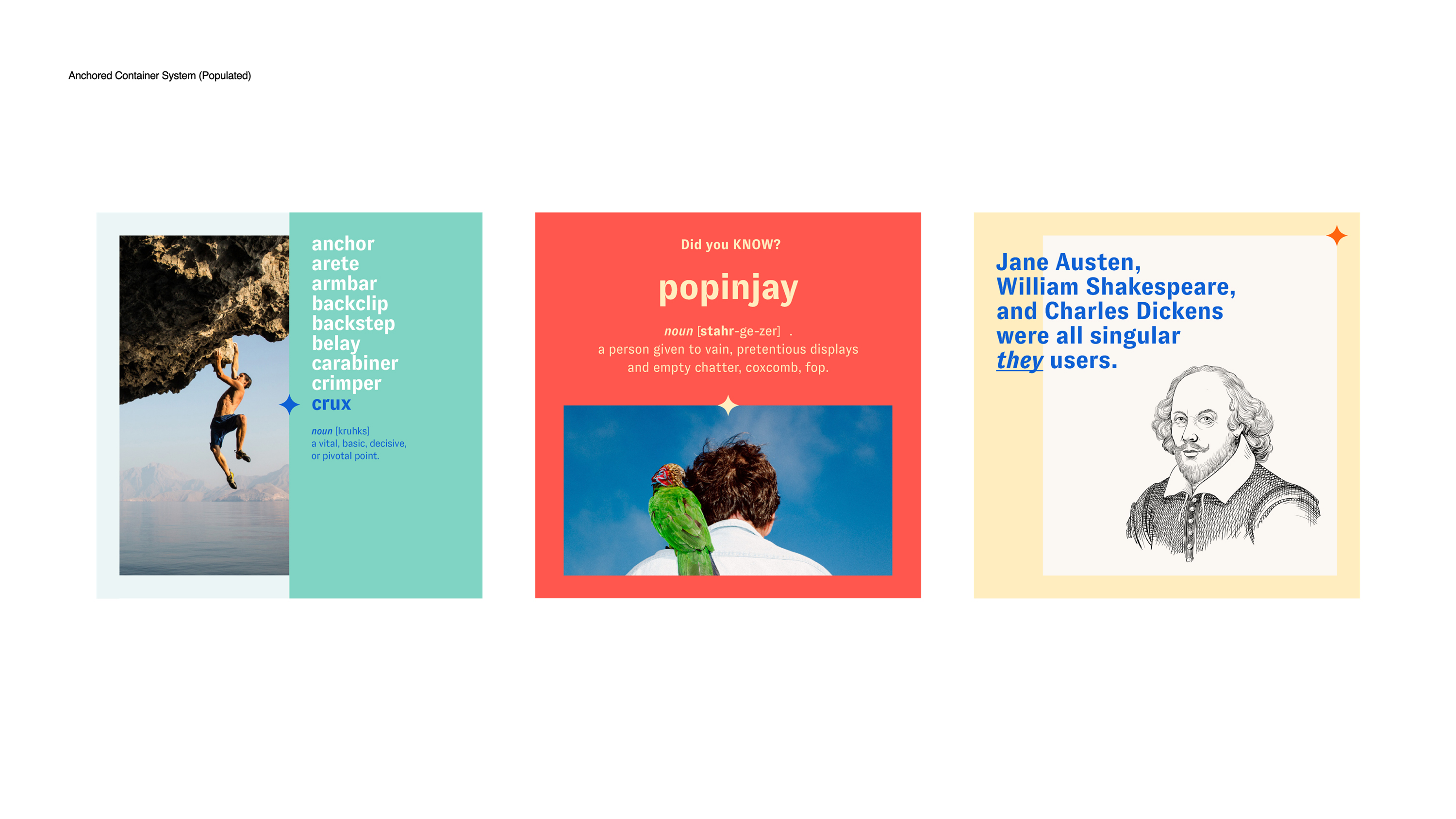
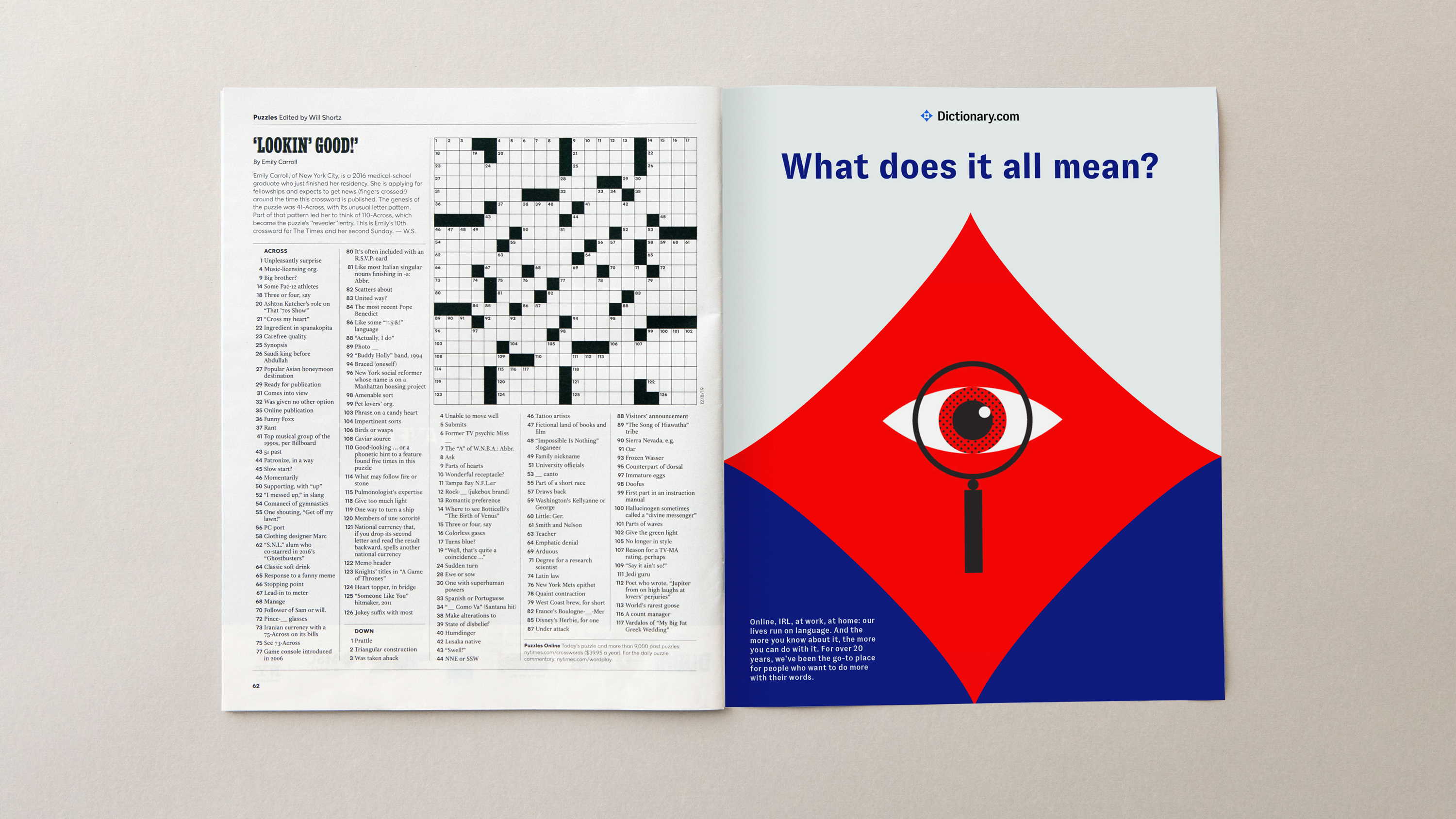
Using language campaign ideas from Reed Words, the Spark system comes to life across a range of applications, focusing on a sense of awe, inspiration, and curiosity. From small, glyph-like icons embedded in a text-centric composition to large, colorful supergraphics in a poster or environment, the logo stretches across a variety of use contexts, expressing the magnitude and flexibility of the English language.
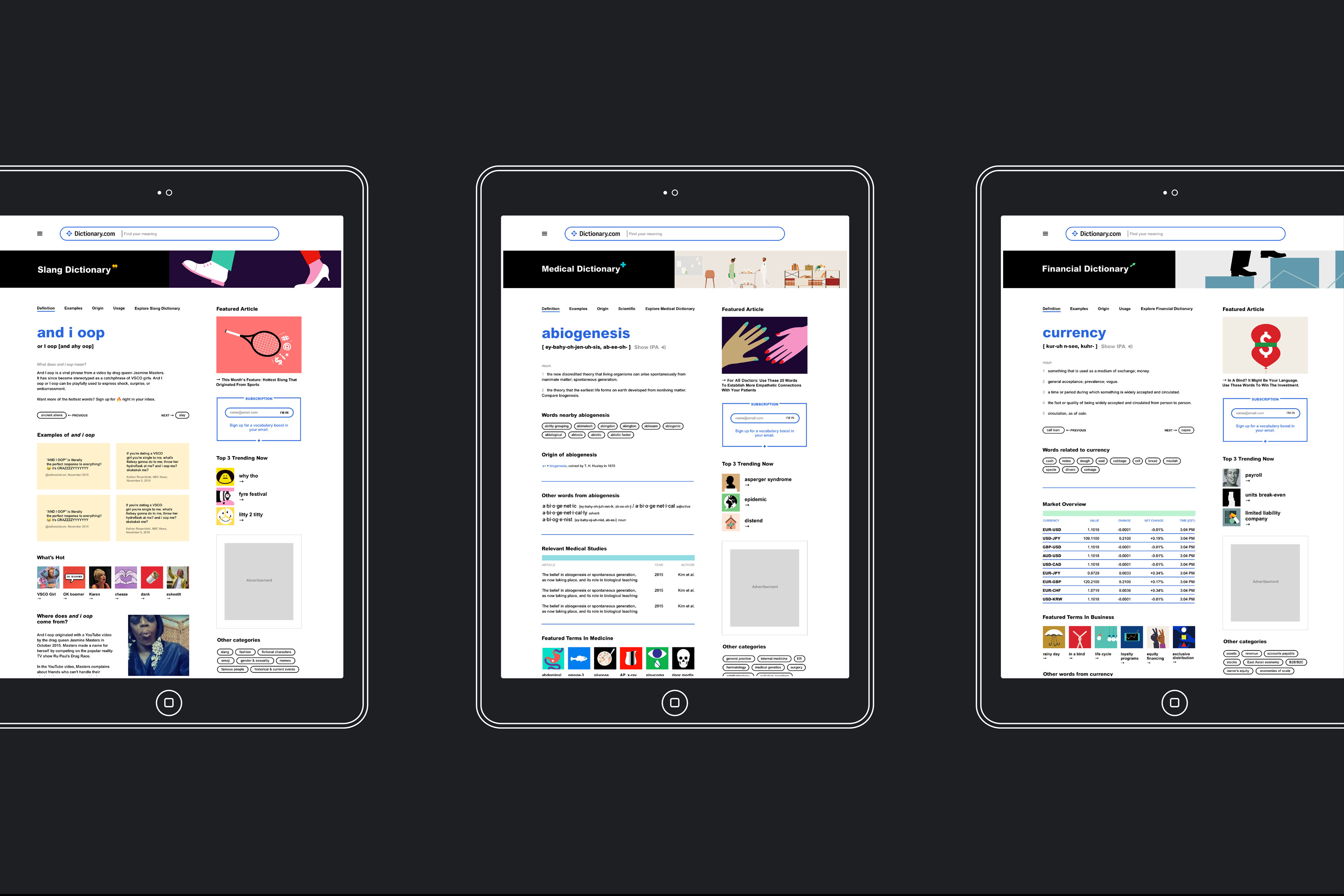
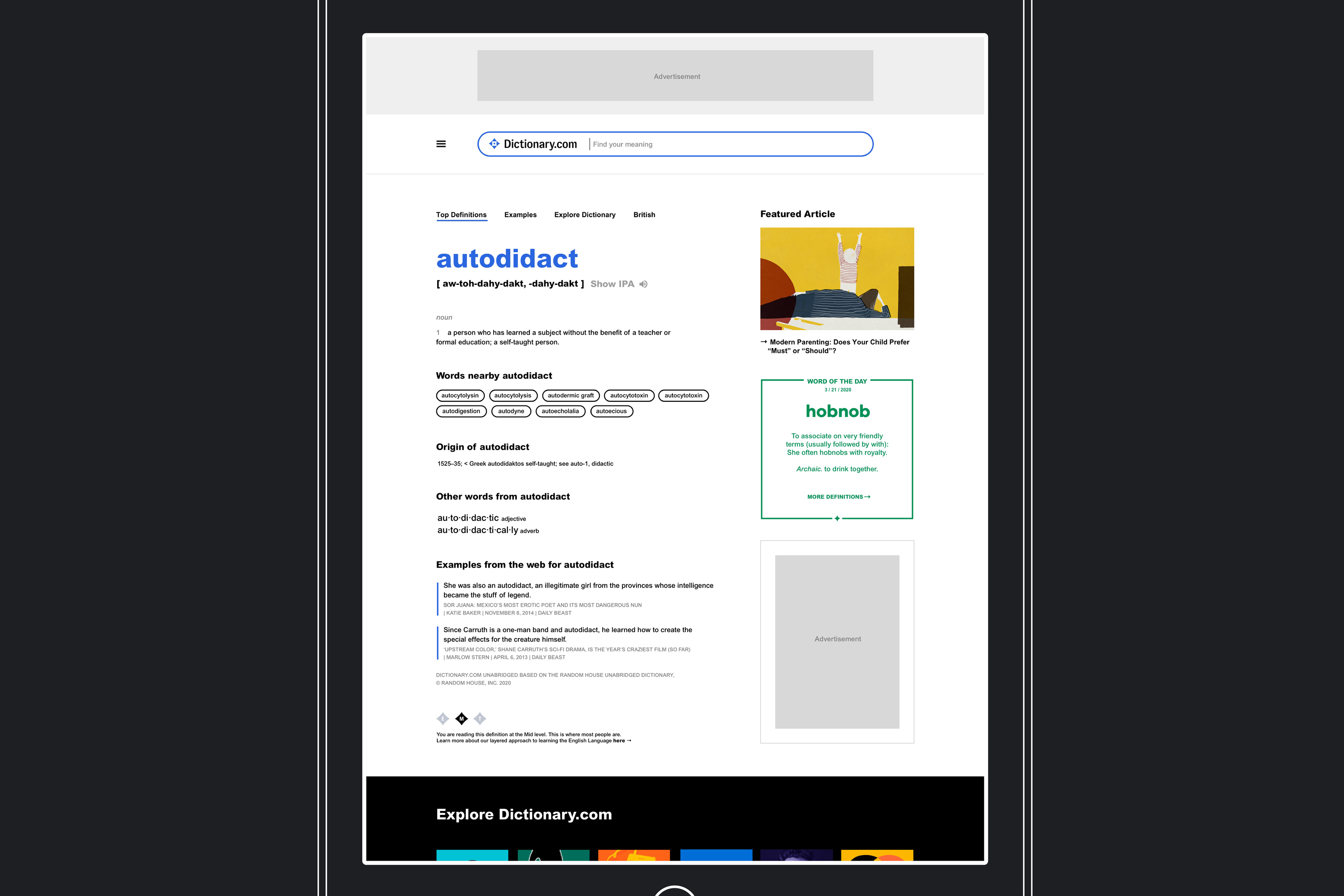
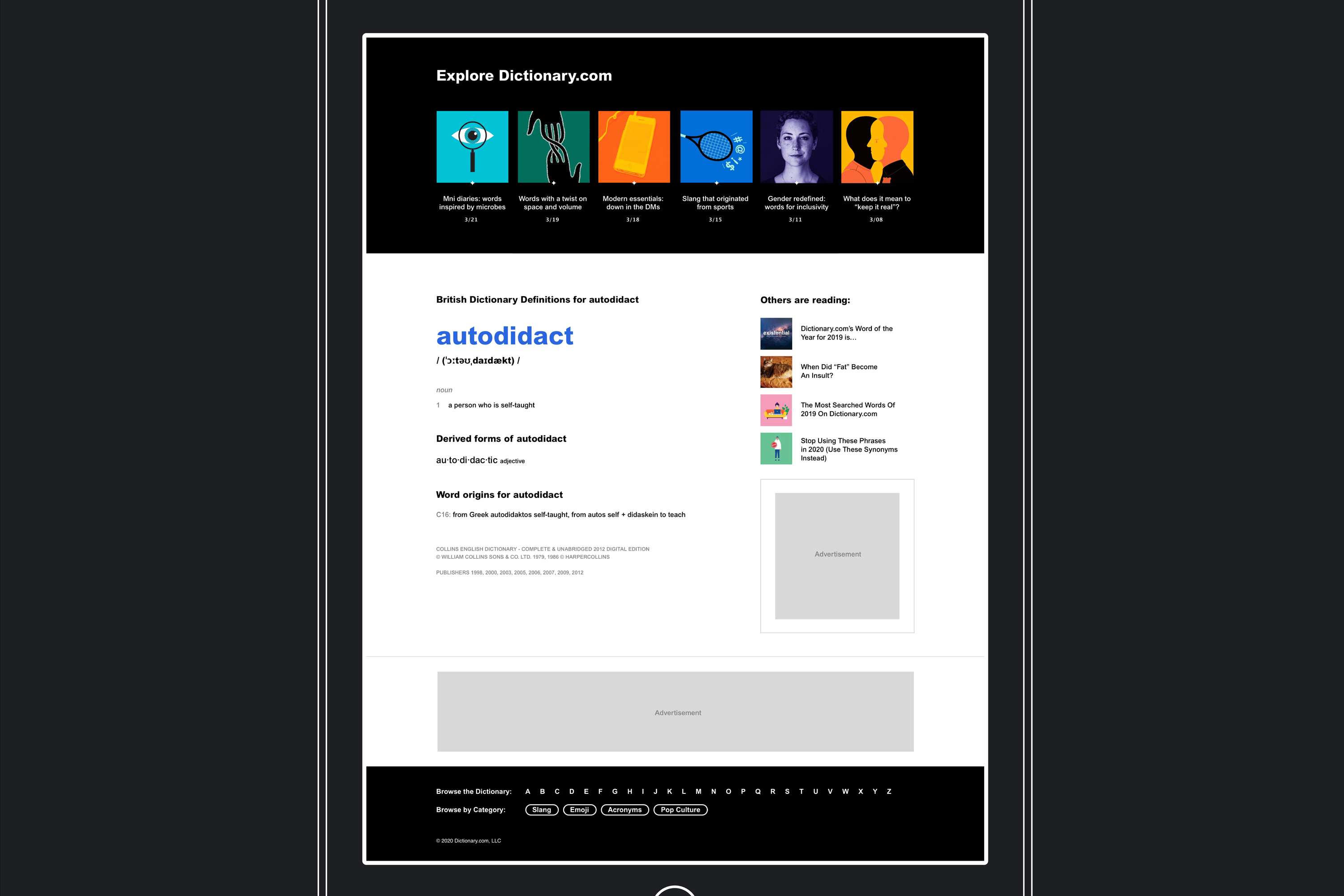
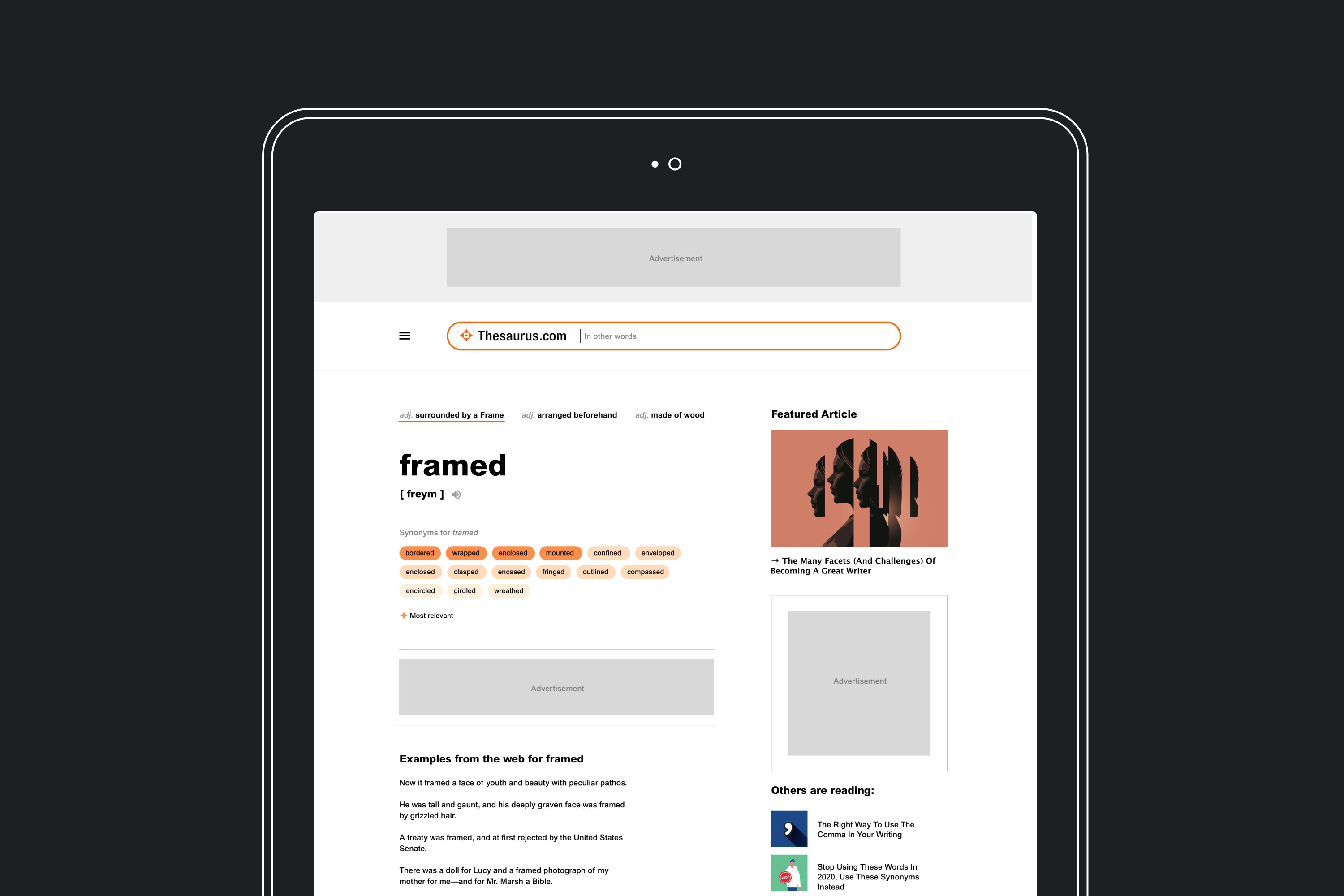
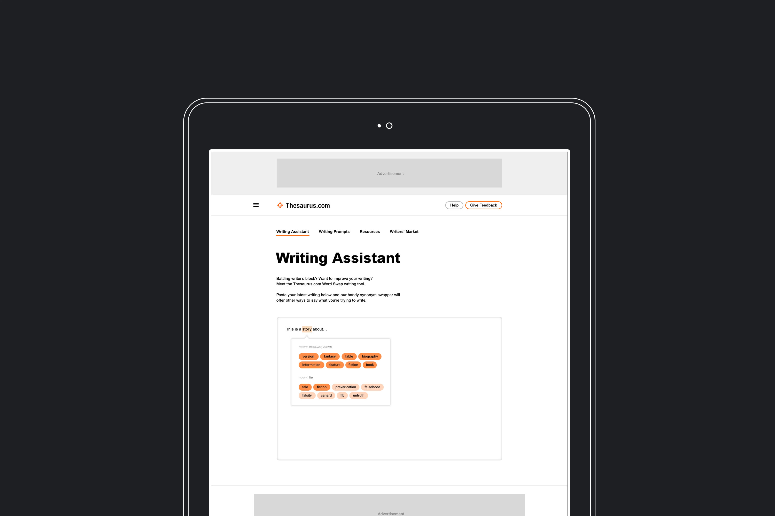
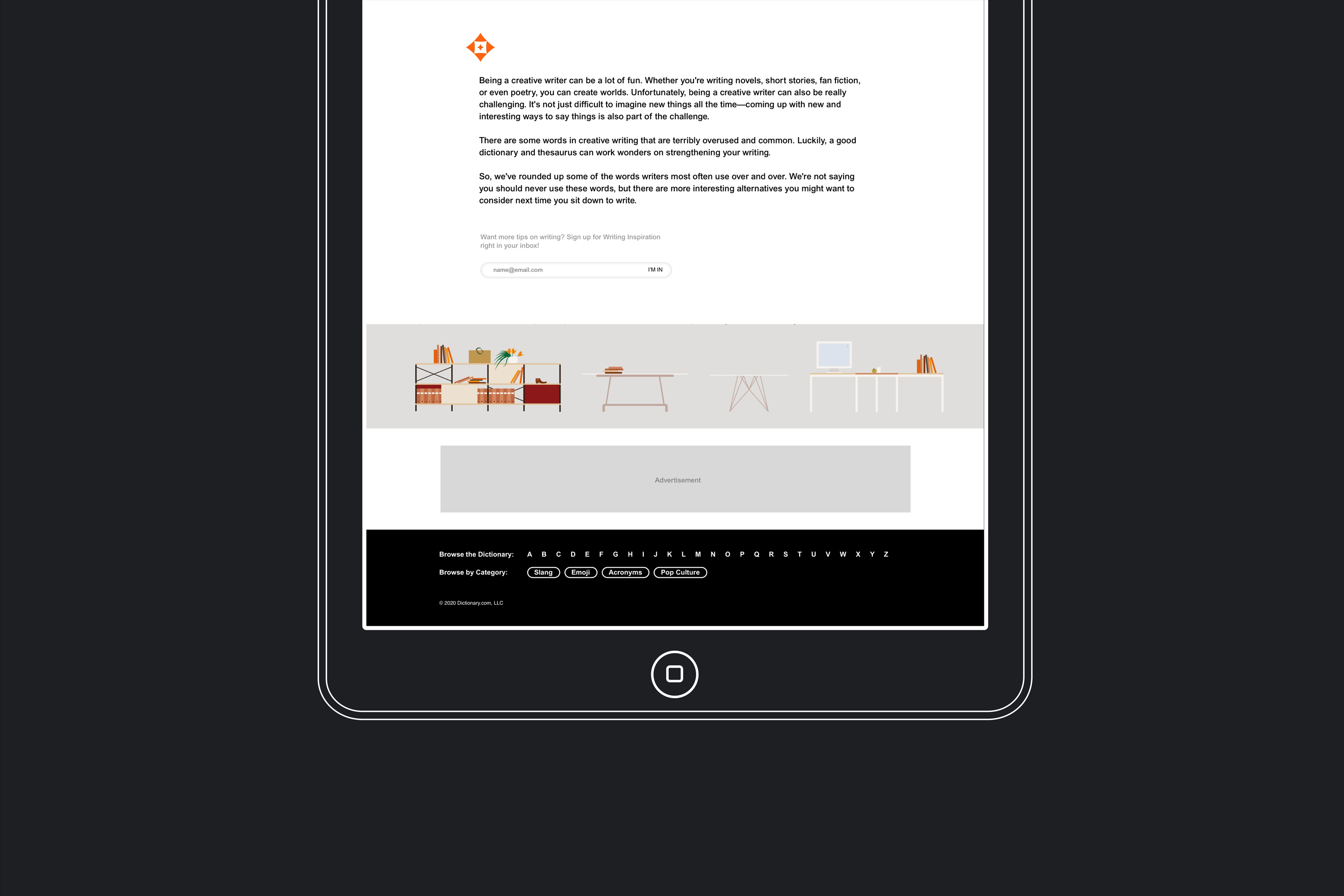
Product UI
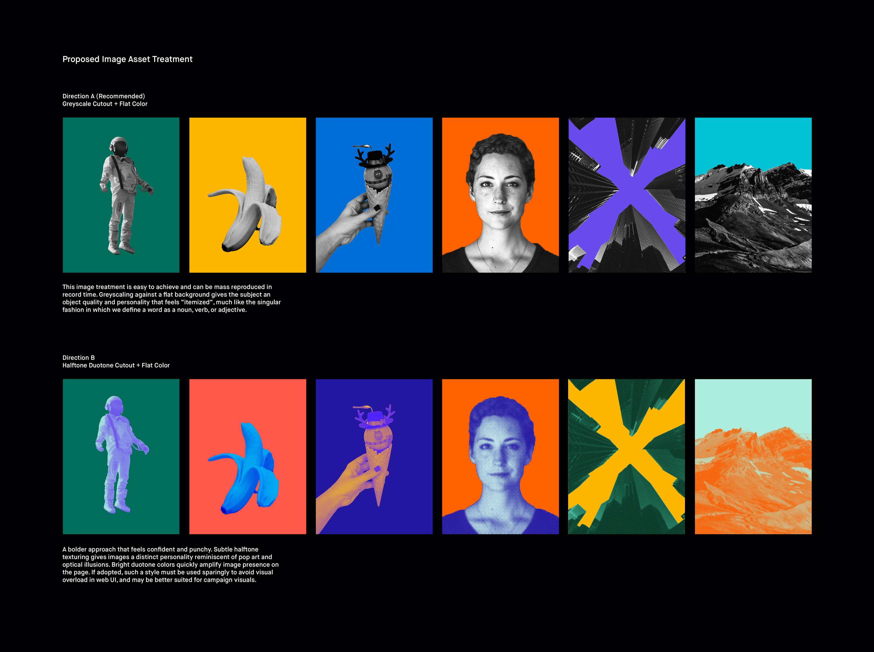
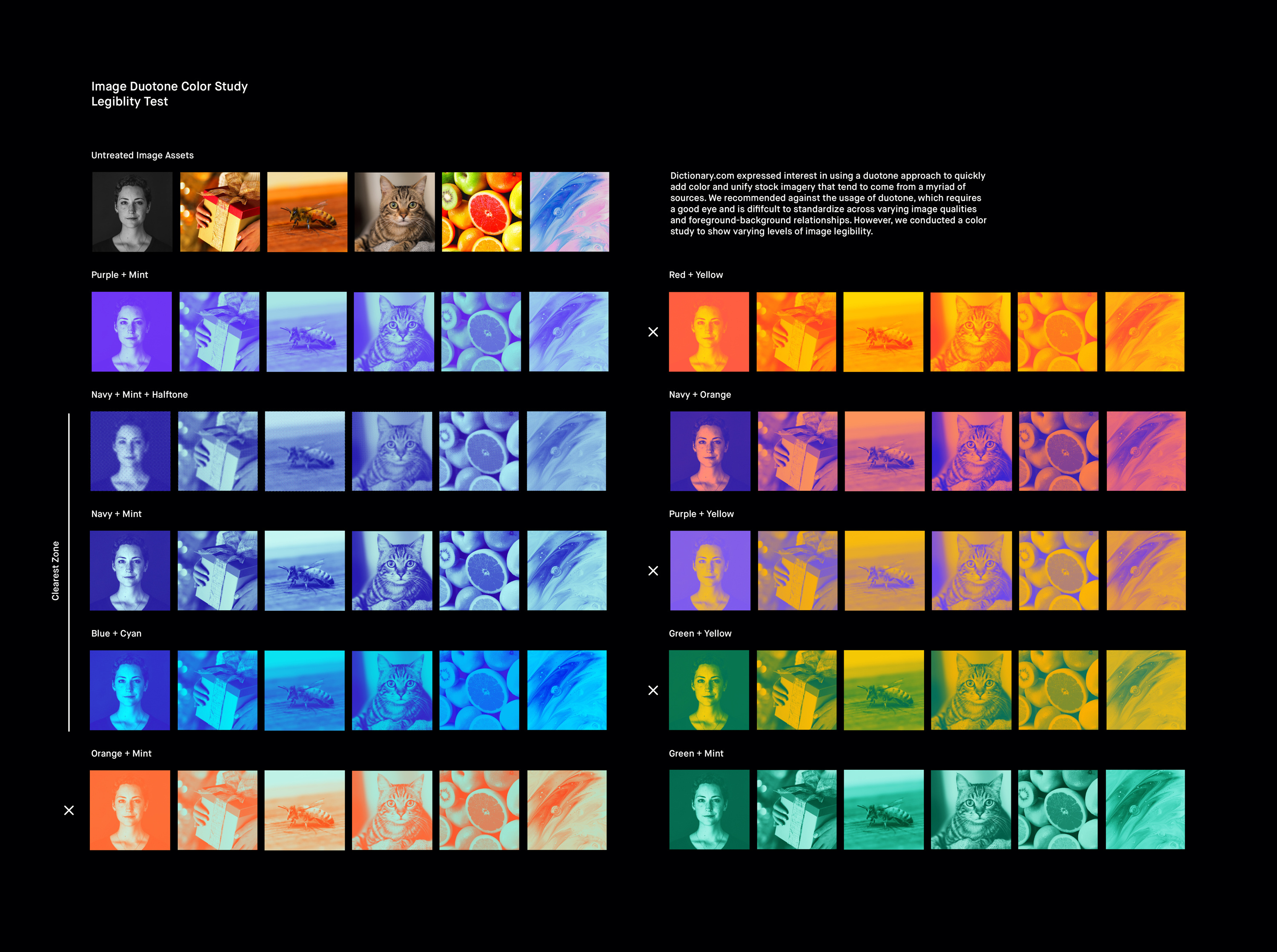
I made gestural sketches for select pages to demonstrate how the brand could flex across web, adhering largely to their existing layout and respecting the wish to retain Arial as a fail-safe system font. Combined with art direction explorations for simple image treatments, these minimal visual moves add hierarchy, clear up content, and spice up a platform that feels chaotic, dull and utilitarian at the moment.