2021
ENVELOPE A+D
Collaborators:
Hoo Koo E Koo (Development)
Eileen Lee (Design)
Hoo Koo E Koo (Development)
Eileen Lee (Design)
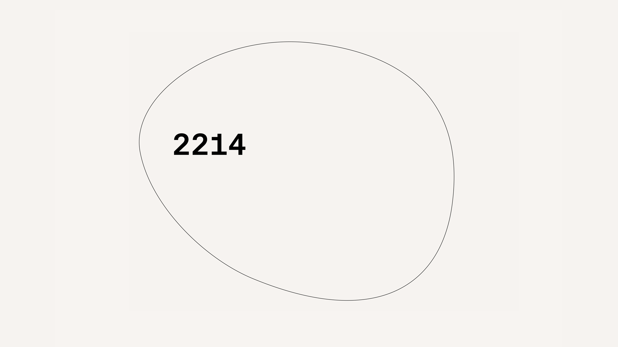
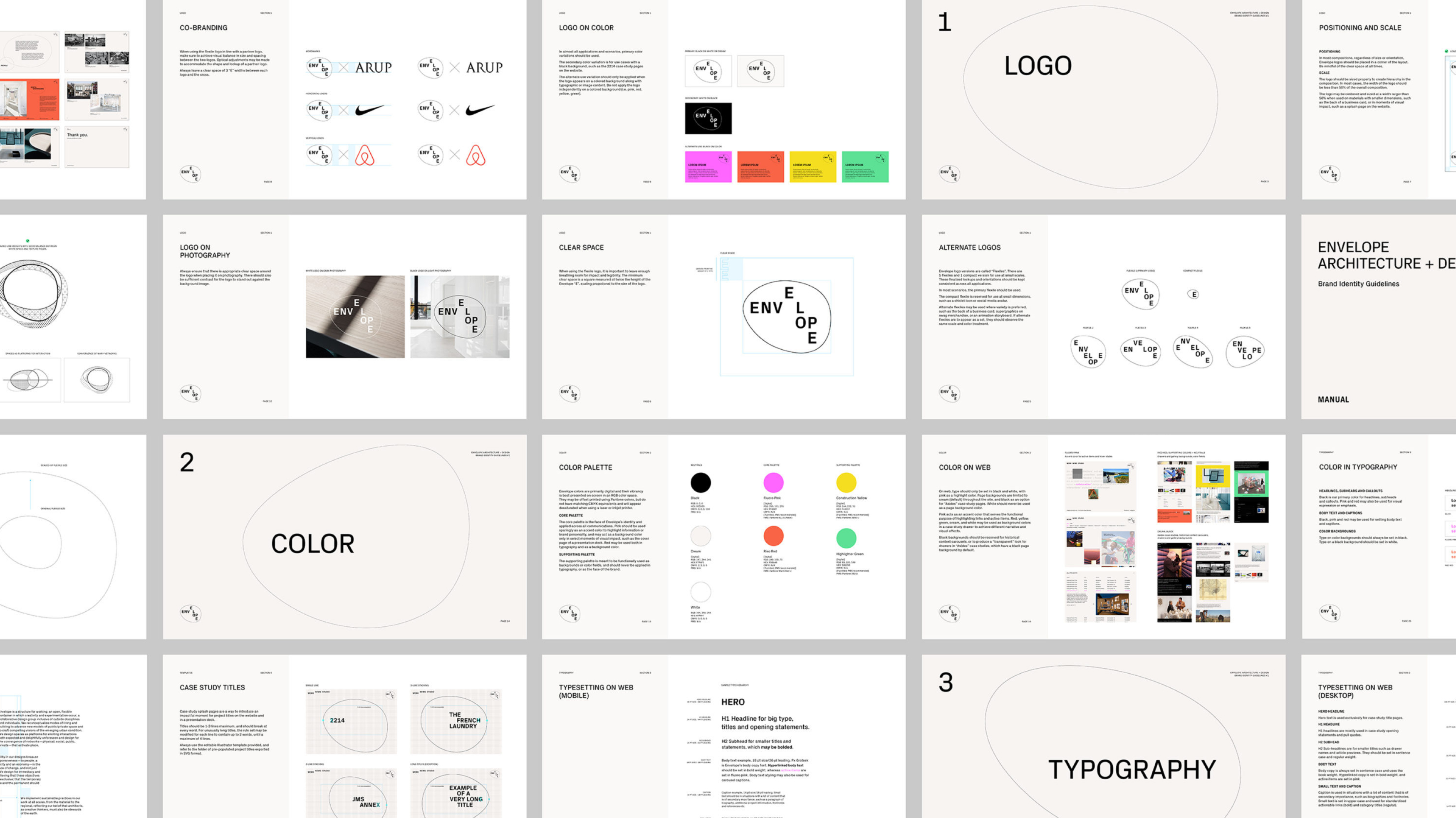
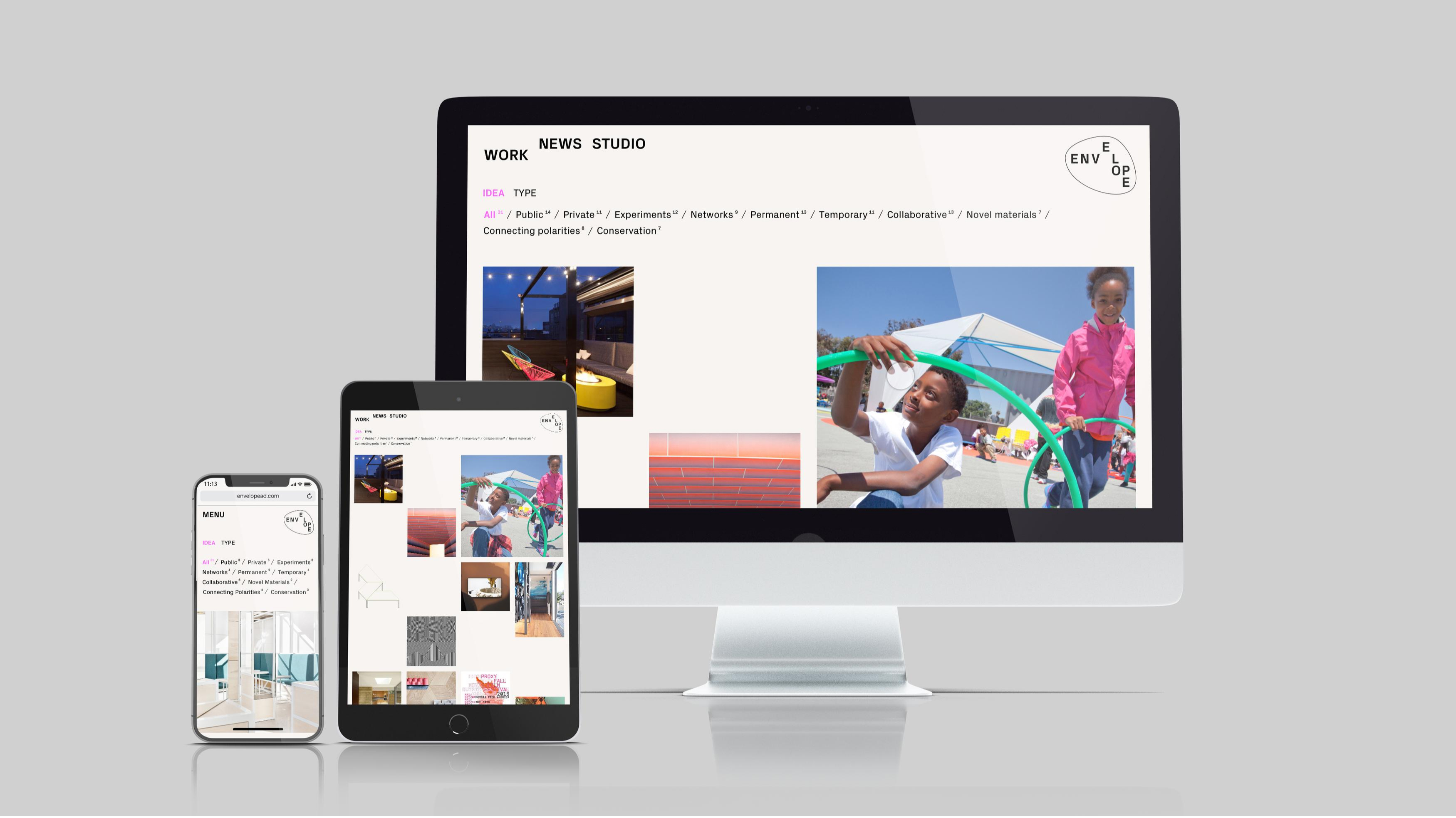
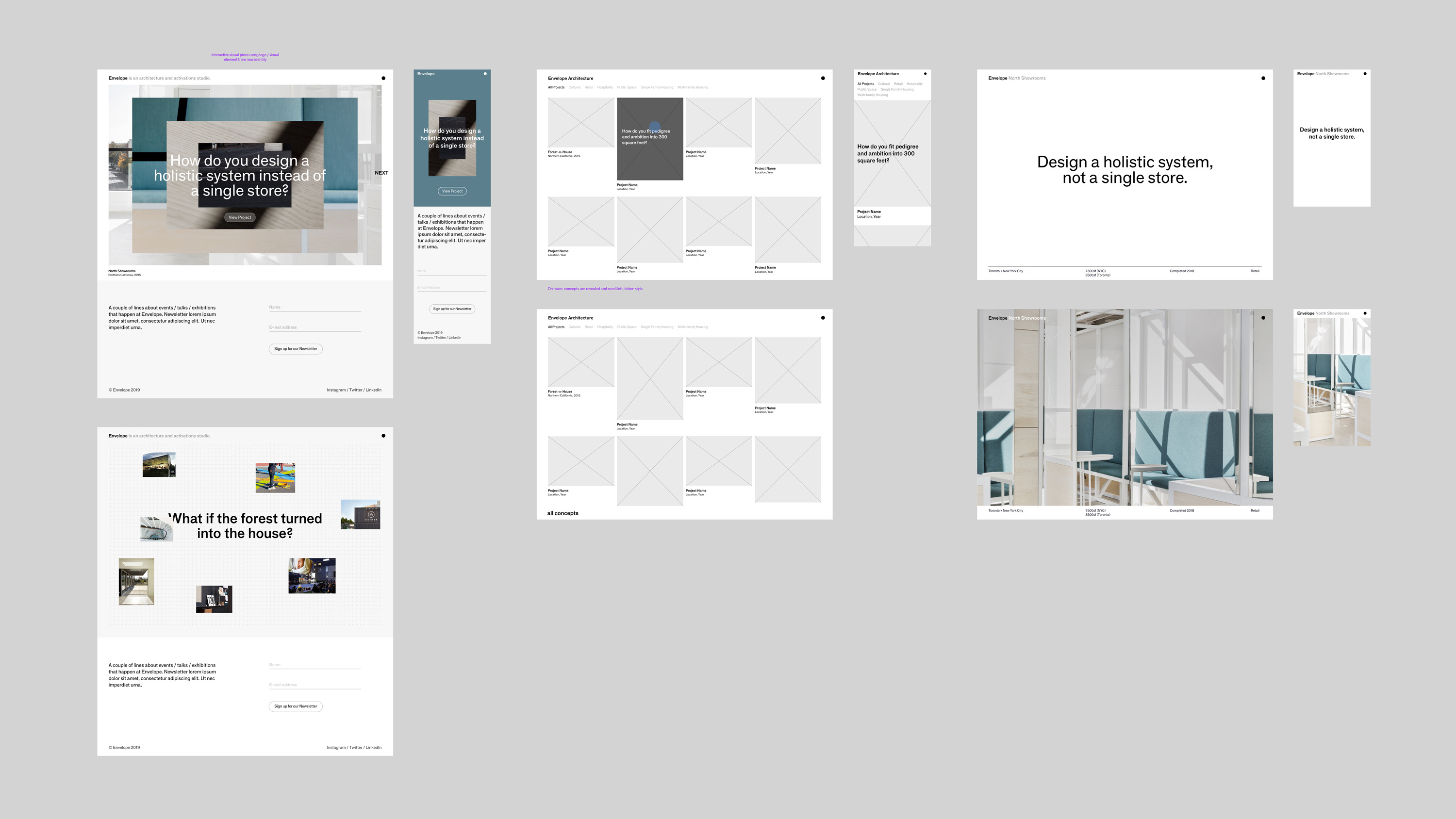
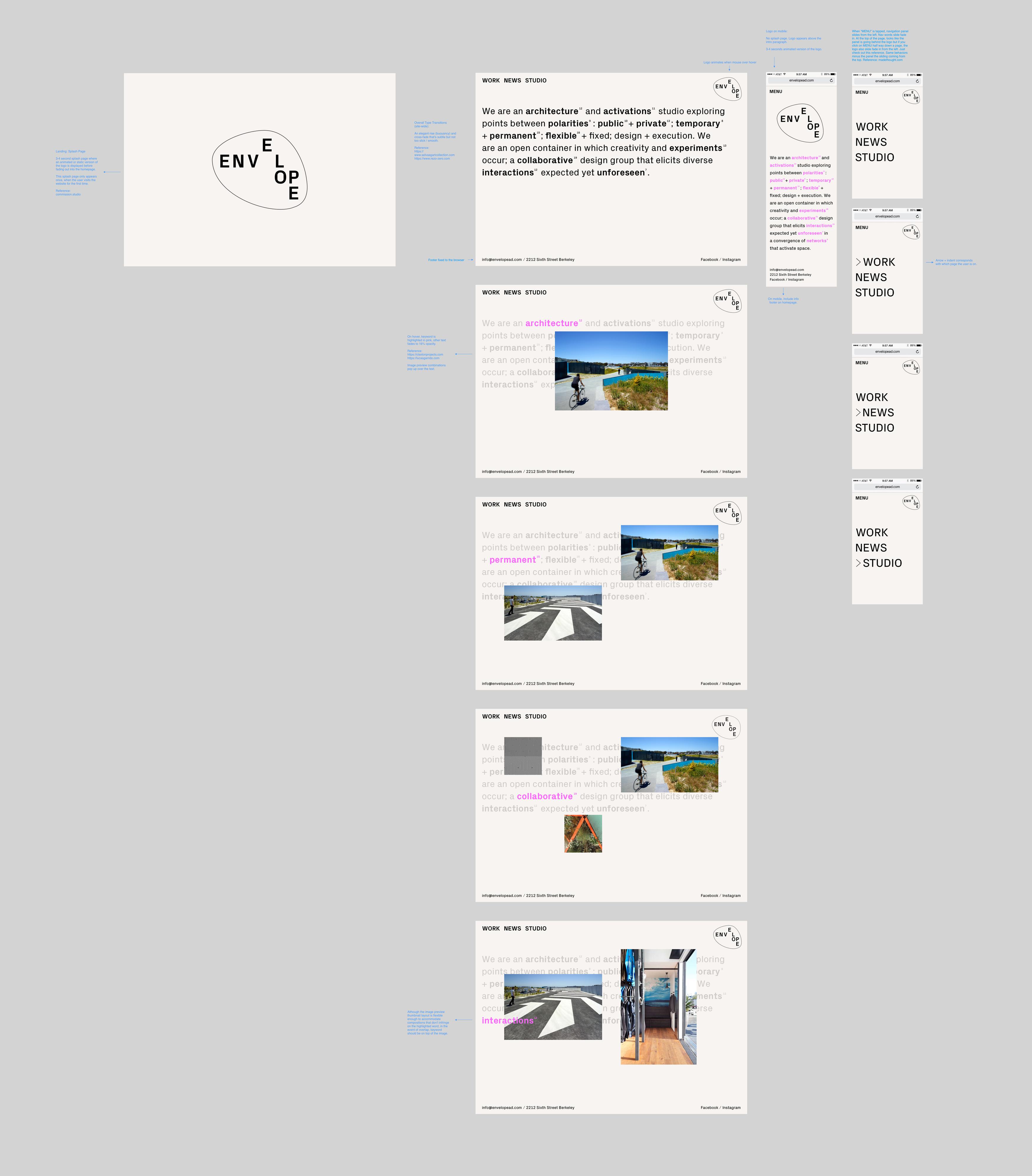
To accommodate Envelope’s wide range of projects, we devised a type-stacking system for composing their titles. Each typographic formation is unique and demonstrates the variety of forms that Envelope can take.
We worked closely with Envelope to translate their plethora of ideas and projects into a unique portfolio site that highlights their ethos of multidisciplinary experimentation.
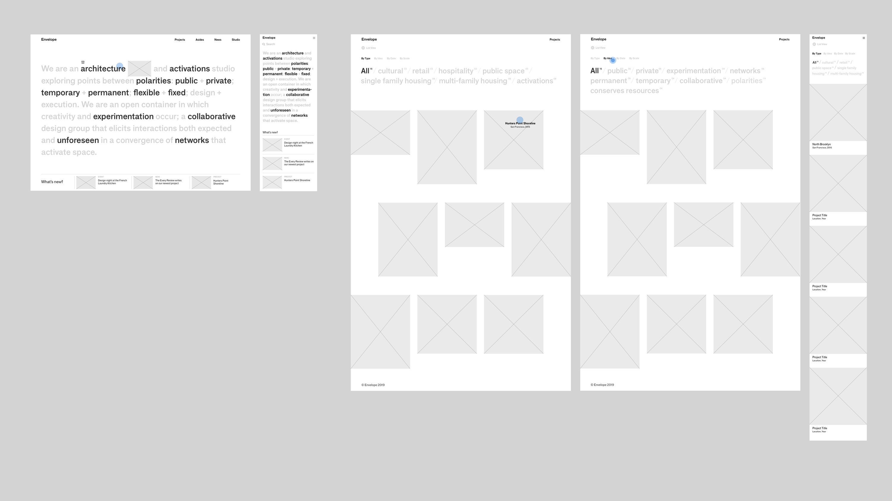
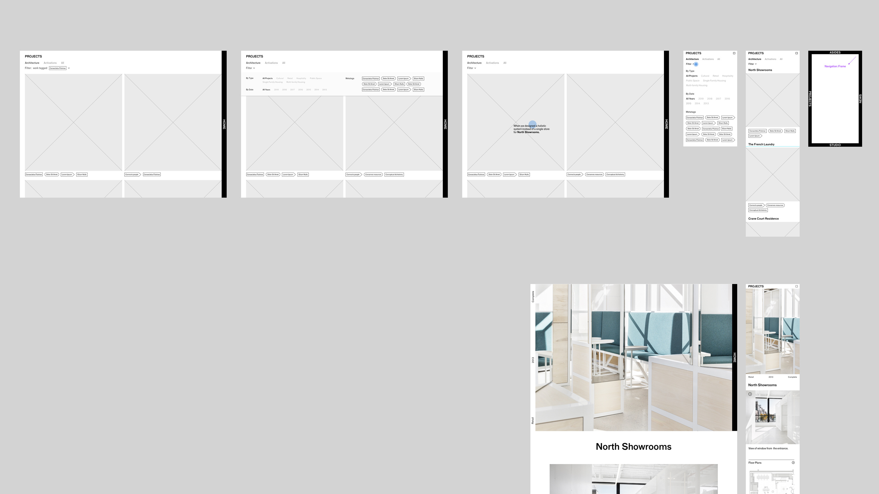
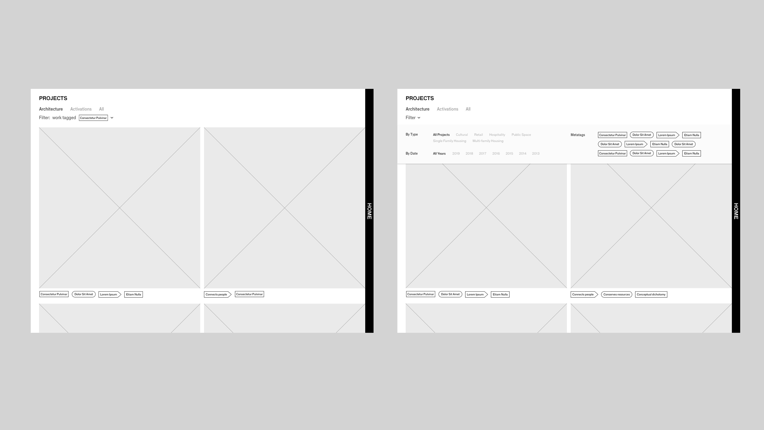
The process began with an intensive week of wireframing, where I presented 3 different conceptual angles to approaching Envelope’s interconnected ouevre of work.
The process began with an intensive week of wireframing, where I presented 3 different conceptual angles to approaching Envelope’s interconnected ouevre of work.
Wires Set A: Typographic
This direction allows users to land on a large typographic statement embedded with iconic keywords that act as springboards for jumping into buckets of conceptual territories. It shows diversity and rigor at a glance.
*This was the direction that Envelope chose.
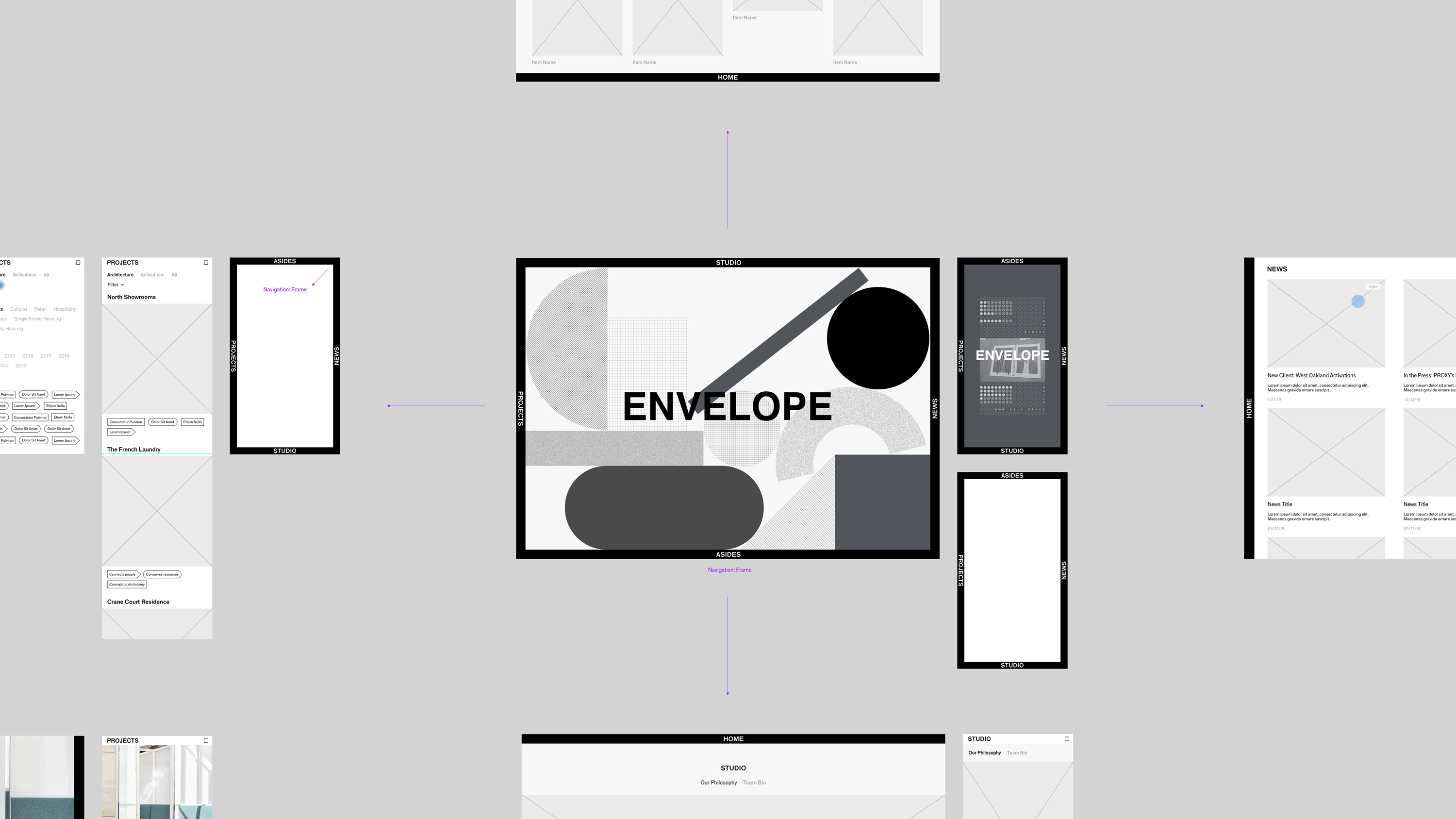
Wires Set B: Sandbox
The second option takes on a four-directional navigation approach, where the user starts at the center and navigates from 4 sides of the browser window to other pages of the site. This interaction stems from the idea that “Envelope” is a fluid container that travels easily into new contexts. Instead of content changing within a fixed frame, the entire frame shifts, along with the user's perception of their position on the site.
Wires Set C: Q&A
The last direction focuses on the idea of projects revolving around a Q&A structure. The homepage features an interactive landing module where project images are folded into concentric frames. A large typographic question central to the project concept is superimposed on each image; the answer to each question is revealed on its respective case study splash page. This highlights Envelope’s inquisitive nature and their always curious, always open approach to each client’s needs.
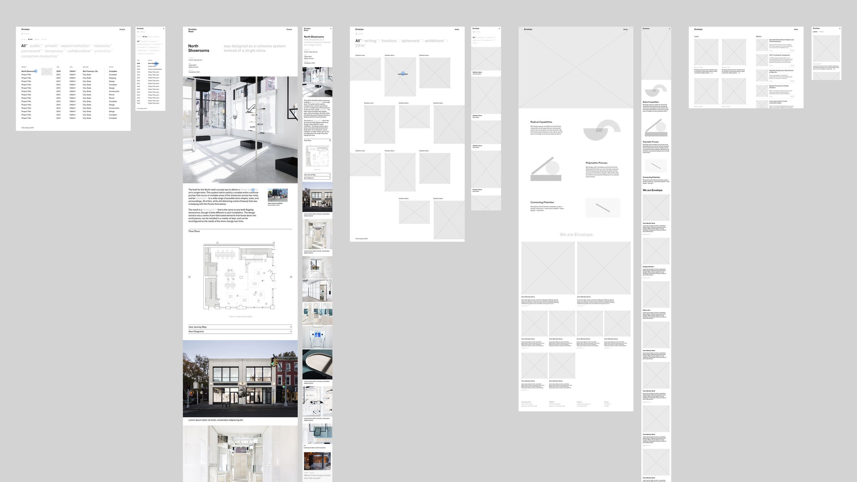
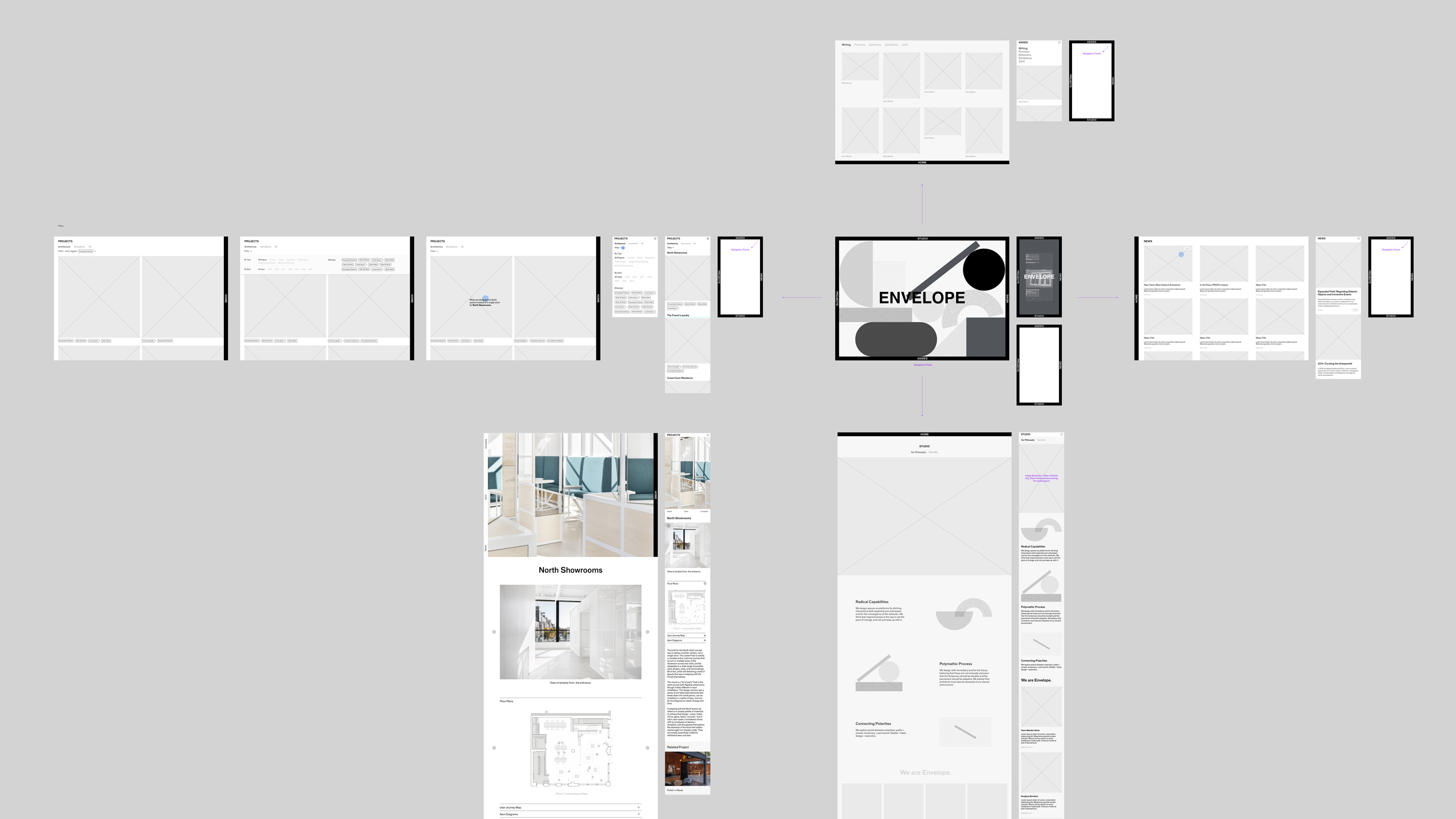
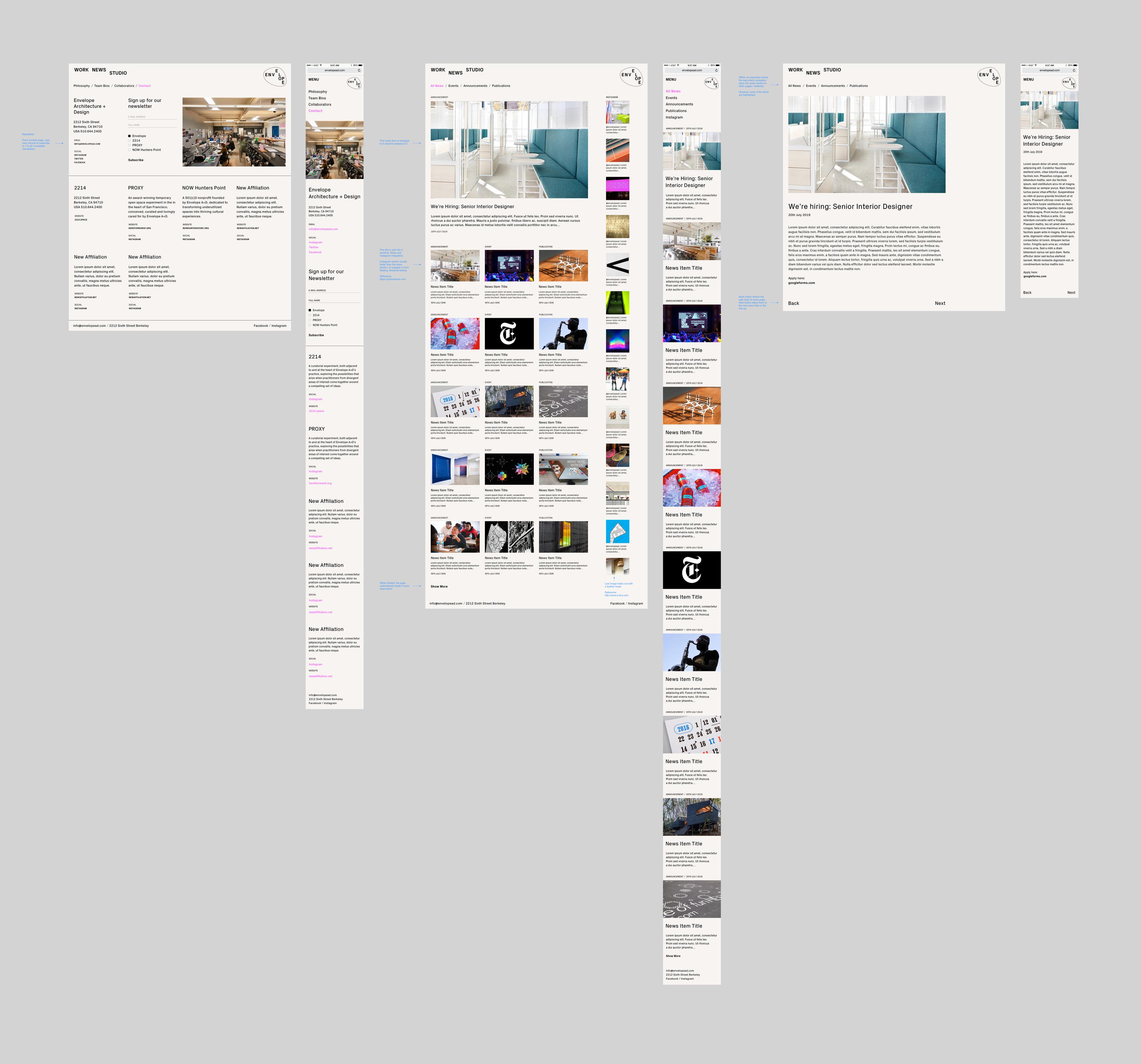
1: Homepage Flow
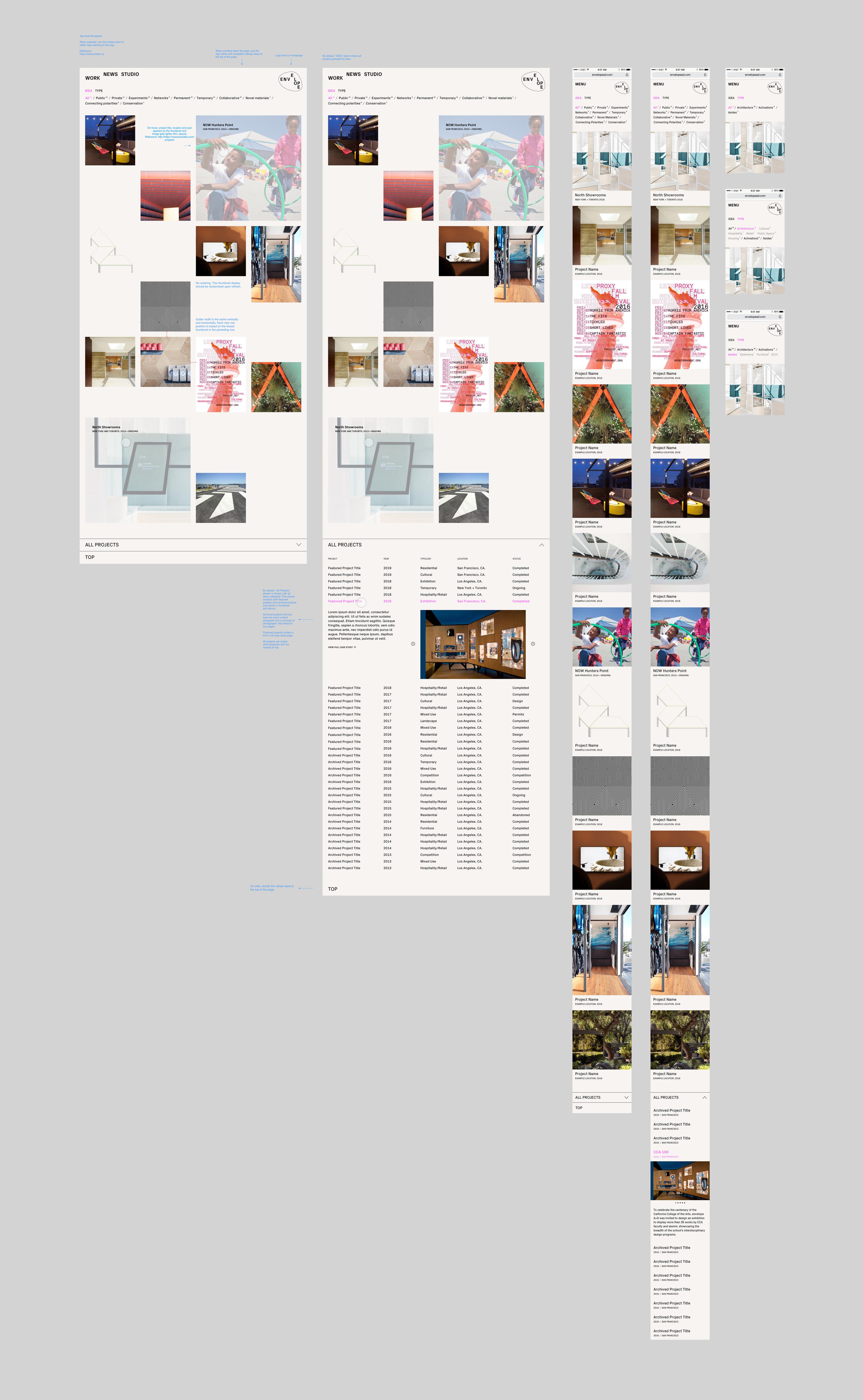
2: Work Page Flow
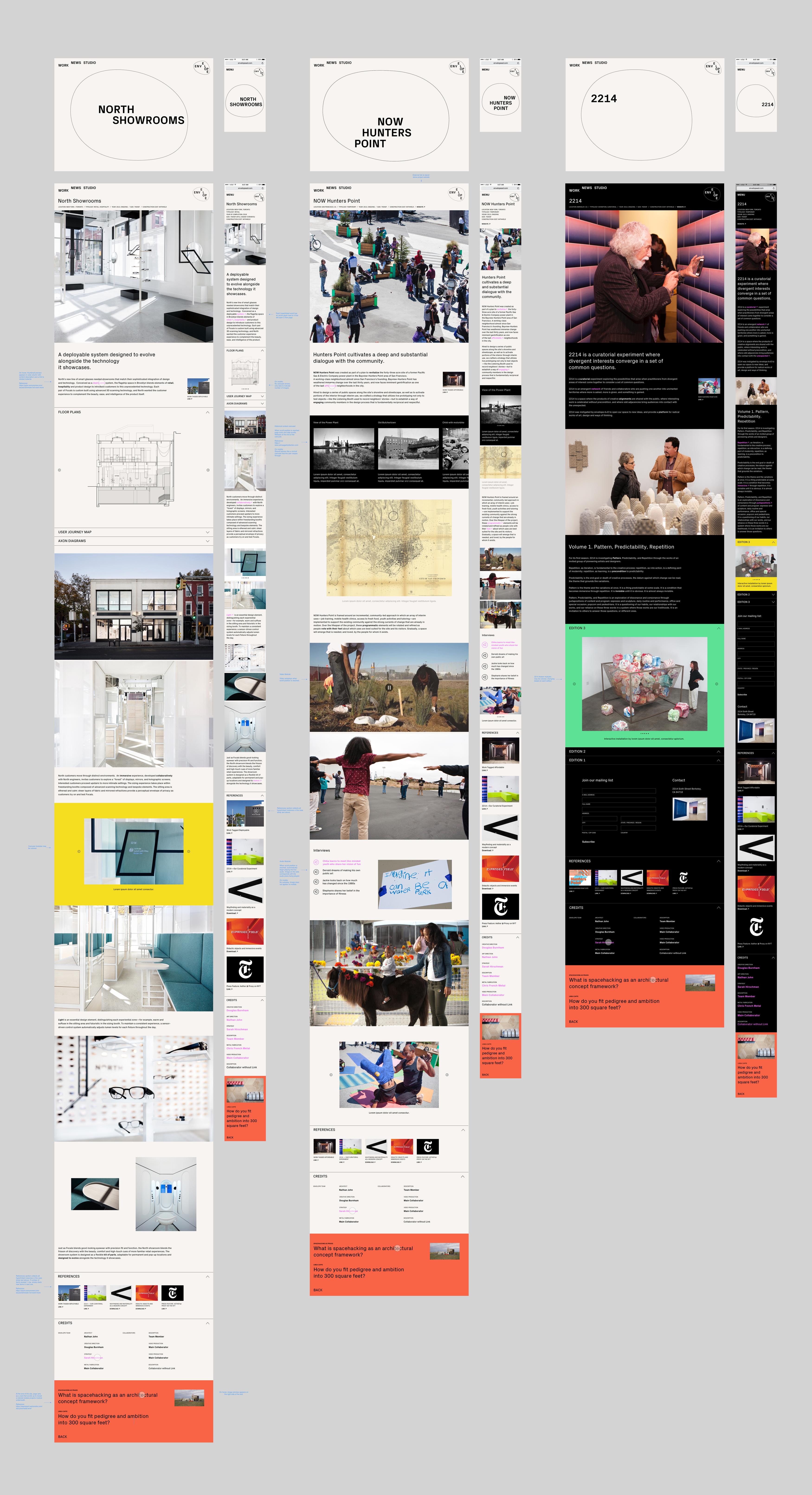
3: Case Study + Asides Page Flow
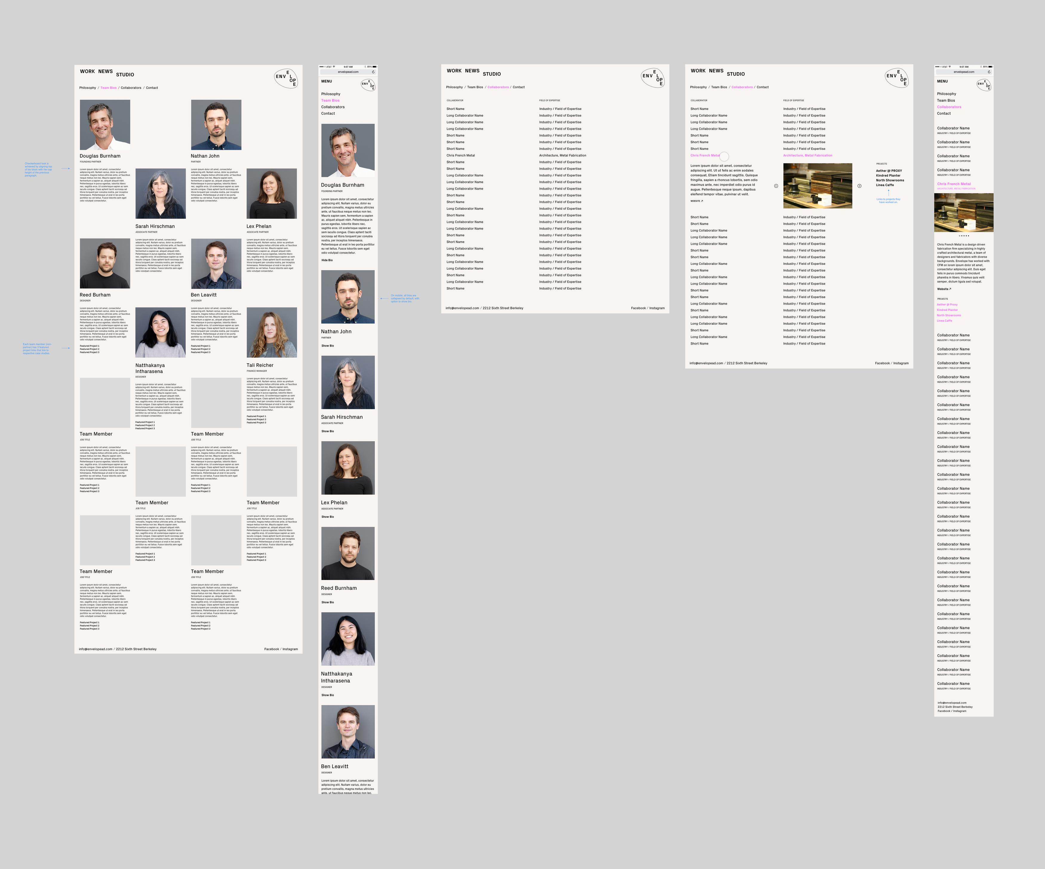
4: Studio Bios + Collaborators Page Flow
5: Contact + News Page Flow
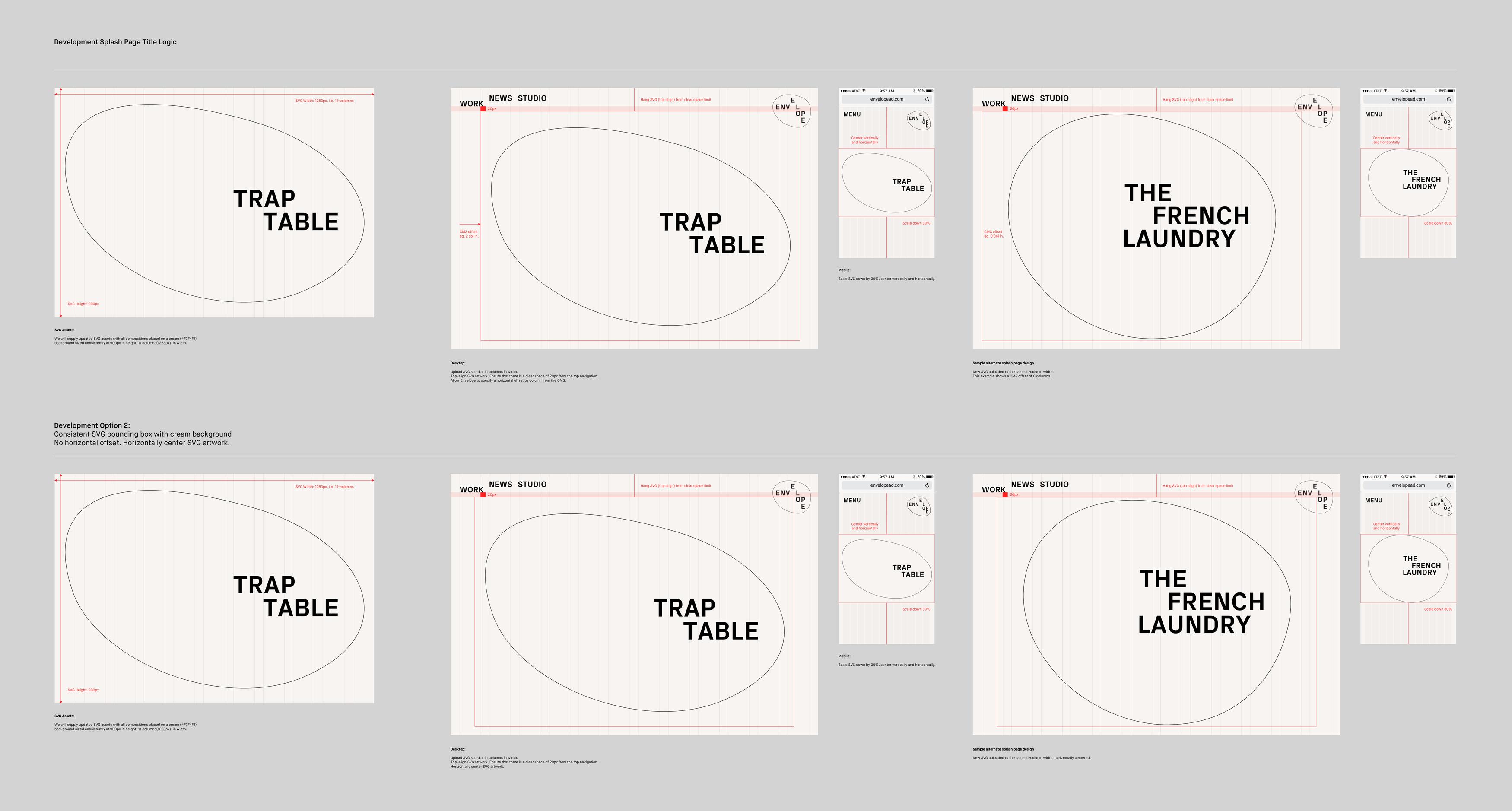
Case Study Title Logic
Case Study splash pages were designed to feature a branded moment where the project title is typeset according to stacking and spacing rules outlined in the brand guidelines. To maintain visual consistency, I engaged in detailed conversations with the developer as to how the CMS field should be set up to enable our client to upload SVGs that will be sized consistently throughout the site.